REFLECTIONS ON LECTURES/SOURCE MATERIAL:
Lighting up the message, symbolism and semiotics of the new.
THE DISTORTION OF THE MESSAGE
In viewing all the source material it's interesting the initial point that Martin makes that "communication is not a given" and that the message sent is not the message received. He goes on to cite Orwell's assertion that "corrupting habits cause people to write and think poorly" and most prescient: that "political language is designed to make lies truthful and the sanctioning of murder respectable". The documentary on Hyper-normalisation (BBC (2016) Adam Curtis: Hypernormalisation) shows this in action as consecutive governments and financial institutions decide what you can see, hear and think and their actions are all justified by the distortions of the truth and manipulation of the collective public mind. In fact the earlier signs, icons and symbols we are invited to navigate using semiotics are benign in comparison to reality and it makes me feel justified in my own cynicism and skepticism. To be honest the whole film leaves you depressed that whether apathetic or active in wanting change, no one in government is listening, and this confirms my belief that governments have always been owned and controlled by financiers, corporations and banks. We live in the age of newspeak where 'War IS peace' and 'Ignorance IS strength'. Orwell was right (again).
On a more positive note, as designers we have a duty to not work for organisations that seek to corrupt an already bombarded public through language, visuals and sound, or to distort the psychological sharing of information. Our dialogue, visual and sonic interpretations should be conveyed responsibility to enhance lifestyles and elicit emotional responses to a brand or product. At the same time we are also in a privileged position and as such should, like James Victoire, use our talents to seek the truth, and put this out into the world, what 'has happened' and 'is really happening' - hopefully to spark debate against those who 'perceptively manage' us in the first place. Although, as James himself found out; finding the right platform to do this is also important otherwise the message is lost.
In Patrick Thomas's exhibition, where he allows participants to add their own vagaries and fake news to live news feeds seems to be the antithesis of James Victoire's work. In his installation; the truth gets muddled up, censored and distorted and the sonic playback adds to the public disorientation. I understand that it is a commentary on the cultural differences, reporting and filtering of the news either through censorship (graphic elements) or the contextual bias of the country reporting it. I just feel we need to simplify the narrative to get to the truth, not add to the confusion. Patrick did also not appear to have an idea of what the meaning of this experiment was – although I did like the title for its double meaning: 'Breaking News'. It's interesting that participants felt empowered by freedom of expression, even though their voice was not being projected anywhere outside of the art space.
"Don't believe it all, find out for yourself, check before you spread, News of the World".
Paul Weller/The Jam
—
CENSORSHIP
I have always found the censorship question an interesting one, which Steven Heller touches on in his book (Steven Heller: Design Literacy/Understanding Graphic Design). Firstly, who are we protecting? Secondly, what is deemed fit for censorship and unfit for the public? Thirdly, what are you hiding/afraid of? Which leads me to – so how is censorship really being used and for what underlying reason? So once again the message is distorted because others seek to control it. If you are censoring to protect my children from an age appropriate film or obscenity fine, but if you are censoring to keep information out of the public domain then I want to have thataccess to make my own mind up.
THE IDEAS WALL: THE CENSORSHIP DEBATE RAGES BELOW
SEMIOTICS
From a design perspective, used in the right way, semiotics are an interconnected way to communicate the message effectively, and to connect and build communities using the right language (tone of voice), symbols, bespoke font, icon set, colour palette, vision and values. The intention is to give meaning to an object (signifier) so that when it is received (Signified) it creates an emotional connection and response. A call to action. The language and medium needs to be tested from a cultural perspective to insure there aren't any negative connotations. I.E: On a visit to Denmark in the early nineties I bought a box of liquorice sweets called 'Spunk'. It goes without saying that this product means an entirely different thing in the UK. In America it probably still means 'pep' or a go-getter. So words and the language you use are very important when designing for a global market. I recently also discovered that 'purple' in Ireland is linked to the church, which explains why my favourite colour never gets through on a project here, even though Cadbury's uses it to great effect.
TAKE OUTS
— If your intention is to communicate a message keep it simple and clear.
— Think about the medium used to convey that message. Where is it seen or heard.
— Think about the global context in which the message is received.
— Are there any barriers to entry: Language, Typeface Use, Colours, Images and Sound.
— Be open, honest and transparent.
Workshop Challenge:
Case Study 2: Take a brand and look at how it is delivered in different countries, e.g. alcohol, tobacco, transport, cars. Is it symbolised in a different way? Why might colour or typeface have been changed? Does it work at a local level and does it work at a global level?
Chosen Brand: Coca Cola
A QUICK LOOK AT THE SEMIOTICS OF THE BRAND
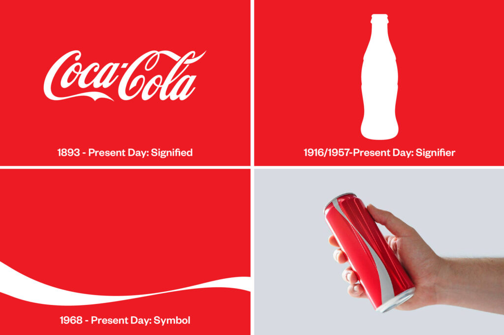
Reflecting on the lecture by Martin Hosken I chose to see how I could pull apart the brand to gain a greater understanding of the signs (Signified/Signifiers/Symbols) used which has lead me onto an interesting angle for my 500 word essay. My own take is that it is that as Coca-Cola is such a recognised brand and in the publics consciousness that if you took away all of the signified messages you would still recognise it. It therefore can live somewhere between a code and a symbol... which is what makes it so iconic. I looked at the history of the core elements that make this design so iconic and also found in my research that a design existed during the month of Ramadan where the logo had been completely removed – thus proving my point.
THE IDEAS WALL
I posted up these thoughts on the ideas wall but got no real response so I will press on.
VISUAL RESEARCH

500 WORD ESSAY
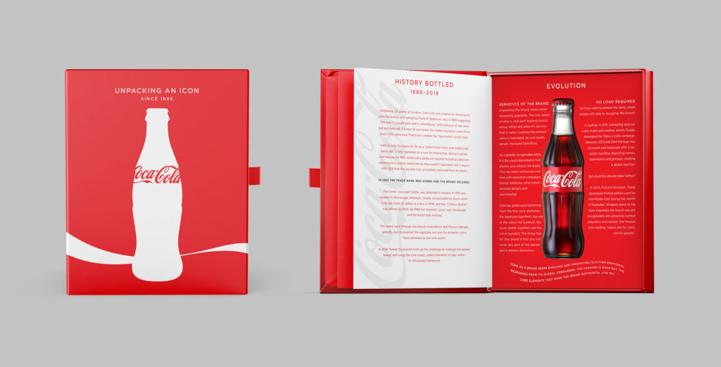
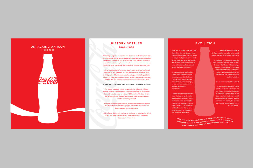
UNPACKING AN ICON
A HISTORY
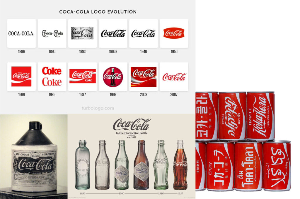
Containing 3.5 grams of cocaine, Cola-Cola was created by pharmacist John Pemberton and named by Frank M. Robinson, who in 1885 suggested "the two C's would look well in advertising". With extracts of the coca leaf and kola nut, it's easy to see where the name inspiration came from and In the same year, Frank also created the 'Spencerian' script logo.
Sold at soda fountains for 5c as a “patent brain tonic and intellectual beverage,” it was marketed as a cure for headaches, stomach aches, and fatigue. By 1891, American's spoke out against including addictive substances in patent medicines as they weren't regulated, but it wasn't until 1929 that the cocaine was completely removed from the drink.
In 1890 the trade mark was added and the brand secured.
The iconic 'coca pod' bottle, was patented in Indiana, in 1915 and created to discourage imitations 'simply recognisable by touch alone'. Cola red made its debut as a disc in 1948, and the "Contour Bottle" was refined by 1950. By 1968 the 'dynamic curve' was introduced and the brand fully realised.
The brand went through successive incarnations and flavour changes globally, but its essence: the logotype, red and the dynamic curve have remained as the core assets.
In 2018, Turner Duckworth took up the challenge to redesign the global brand, and using the core assets, added elements of play within its structured framework.
SEMIOTICS OF THE BRAND
Unpacking the brand raises some interesting questions. The core assets all play a vital part towards brand recognition and while it's obvious that in some countries the product name is translated, its core assets remain the brand identifiers.
As a globally recognisable entity, it is the visual interpretation that attunes your mind to the brand. This has been reinforced over time with innovative campaigns, flavour additions, artist commissioned designs and merchandise.
Coke has global reach stemming from the four core elements: the logotype (signified), the use of the colour red (symbol), the iconic bottle (signifier) and the curve (symbol). The litmus test for this brand is that you can cover any part of the design and it remains distinctive.
NO LOGO REQUIRED
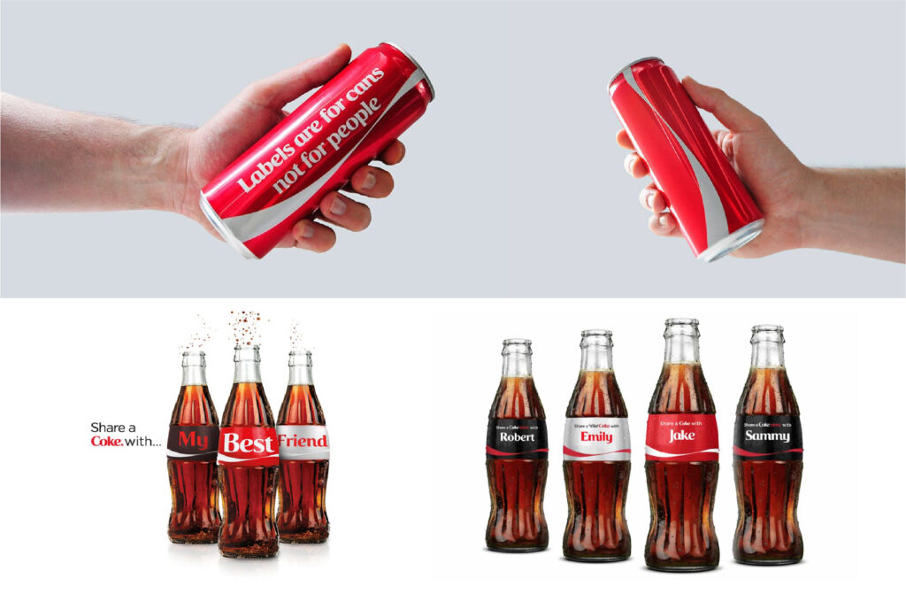
So if you were to remove the name, would people still able to recognise the brand?
In Sydney in 2011, marketing director Lucie Austin and creative Jeremy Rudge, developed the 'Share a Coke' campaign. Between 2013 and 2014 the logo was removed and replaced with a bespoke typeface depicting names, expressions and phrases, creating a global reaction.
But could this idea be taken further?
In 2015, McCann-Erickson, Dubai developed limited edition cans for the Middle East during the month of Ramadan. Stripped down to the bare essentials the brand was still recognisable and utilised to combat prejudice and racism, the reverse side reading "labels are for can's, not for people".
Coke as a brand keeps evolving and innovating, eliciting emotional responses from its global consumers. The cocaine is gone but the core elements that make the brand successful live on.
SOURCES:
1) https://teens.drugabuse.gov/blog/post/coca-colas-scandalous-past
2) https://www.insider.com/evolution-of-coke-coca-cola-history-2018-5#in-1915-the-design-became-closer-to-the-bottle-we-know-and-love-today-4
3) https://www.coca-colacompany.com/news/coca-cola-red-our-second-secret-formula#:~:text=The%20introduction%20of%20the%20now,a%20promise%20in%20a%20way.%E2%80%9D
4) https://www.coca-colacompany.com/news/coca-cola-red-our-second-secret-formula
5) https://www.coca-cola.ie/marketing/campaigns/iconic/share-a-coke-making-a-name-for-ourselves
6) https://www.wired.com/2015/07/coca-colas-beautiful-new-logo-no-logo/
WORK IN PROGRESS SKETCHES
FINAL EXECUTION
Started sketching out a blandwich of an editorial layout and then thought it would be much better presented as a piece of packaging. See if you can spot the design flaw haha...