REFLECTIONS ON LECTURES/SOURCE MATERIAL:
How typographic conventions and design can inform and imbue the meaning of a given text
LECTURE PART 1/TYPE & PRESS: KRISTOFER SOELING (REGULAR PRACTICE)
It was interesting to listen to, what is for me, a refresher of the history of the technology involved in type production for print and print processes, from scribes and Gutenberg's 42 line bible to where we are today. I found the lecture to have some omissions and inaccuracies but overall it was an interesting listen.
I.E: Kristopher talks about Gutenberg's movable type process as a liberating force for the masses and while it was revolutionary in book production, those books were still only for the preserve of the rich and educated with large swathes of the European population being illiterate. According to McSweeney's (Internet Tendency) "In the 14th century, 80 percent of English adults couldn’t even spell their names. When Johannes Gutenberg invented the printing press in 1440, only about 30 percent of European adults were literate. Gutenberg’s invention flooded Europe with printed material and literacy rates began to rise. In the 17th century education became an emphasised part of urban societies, further catalysing the spread of literacy". (Retrieved from: https://www.mcsweeneys.net/articles/literacy-rates). This gave the church and the powerful an enormous hold over the uneducated populous.
Travelling from the middle ages, through the various processes and innovations and up into the 20th century we landed at the feet of Letraset (dry transfer lettering). Here Kristofer refers to its inexpensive nature and of it almost being a separate entity from the 'expensive' phototypesetting process. This was not really the case. While dry transfer did afford the designer freedom in font choice and have a variation in both weight and scale it was only ever really used in headline production and not for the body of the text which would have still be output by professional typesetters. What really democratised the process for designers was the introduction of desktop publishing and 3rd and 4th generation Macs. Don't believe the hype kids… the first mac was only fit for word processing and all early macs would crash if you so much as sneezed.
At this time (mid to late '80's) fonts were only really starting to be digitised, and the ones that were available were wildly expensive as you could only buy entire font libraries on your floppy disc. So there was in fact, still a crossover between using conventional typesetting houses and in-house design for more variation in type design.
LECTURE PART 2/TYPE & DESIGN: KRISTOFER SOELING (REGULAR PRACTICE)
The second part of the lecture focussed on the design characteristics of type itself and its use by designer's from the Trajan column, the first incarnation of what we call 'Roman' type, to the present day. Again, even though Kristopher did emphasise that it was a brief synopsis of both history and design I felt there were some omissions that shouldn't be left unchecked.
I.E: The connection between Edward Johnston and Eric Gill was left as if the two had never come into contact with each other. It would be true that when Johnston designed the type for the London Underground that it became the property of the company, but as a student of Johnston, Gill had a direct source to his master and mentor and this had a massive influence on the outcome of the design of Gill Sans. According to Oliver Wainwright "His former student was perhaps driven by the guilt of seeing the success of his own typeface, Gill Sans, which he admitted had been heavily based on Johnston’s work". “I hope you realise that I take every opportunity of proclaiming the fact that what the Monotype people call Gill Sans owes all its goodness to your Underground letter,” Gill wrote in a letter to Johnston later in life". (Retrieved from: https://www.theguardian.com/artanddesign/2016/mar/10/edward-johnston-london-underground-typeface-100-years-ditchling-sussex-eric-gill).
"Nobody had such a lasting effect on the revival of contemporary writing as Edward Johnston. He paved the way for all lettering artists of the twentieth century and ultimately they owe their success to him".
Hermann Zapf
—
It was interesting to hear Herbert Bayer's utopian proclamation when designing the 'Universal Typeface' that 'all type should be one case for a classless society'. This points me to a later text in Williams and Kubel's book (New Perspectives on Typography), where Rick Poynor discusses the findings of the Simplification Centre's study into the public's perception of typography. The outcome being that 'treatments of type and the impression of busyness are more important than the choice (or style) of typeface. In short: what we see as designer's is just not how it is perceived by other and I think had Bayer's font been set in large swathes of body copy it would have been rejected as illegible by most European readers. Although it does not take away from the aesthetic beauty of both the way the font is drawn and displayed by Bayer and for me this is one of the most interesting and exciting periods between Germany and Switzerland in all of type history.
Again, in Kristopher's lecture I feel the period between Swiss modernism and Neville Brody was left out completely. I'll say it again – it's as if the '50's and '60's never happened.
MEET BRADBURY THOMPSON
With Bauhaus masters and the 'International' typographic style landing in America, a period we now know as mid-century modern was about to begin. Bradbury Thompson is not necessarily linked to either movement but you can't fail to see a systematic approach to colour, image and asymmetry in his work, all injected with joy and an inherent love for typography and layout.
According to the Cary Graphic Arts collection: "for over sixty-some years he unfurled an astonishing talent and embraced every graphic design opportunity he could. He had an uncanny ability to merge and blend modernist typographic organisation with classic typefaces and historic illustrations, all seasoned with affectionate sentiment and impeccable taste". (Retrieved from: https://www.rit.edu/carycollection/bradbury-thompson).
“The art of typography, like architecture, is concerned with beauty and utility in contemporary terms… (the designer) must create in the spirit of his own time, showing in (his) designs an essential understanding rather than a laboured copying of past masters.”
Bradbury Thompson in 1956
His design, art direction and typographic work spanned across magazines, printers promotional materials, bibles, and contemporary postage stamps to name a few. He was awarded many accolades and taught at Yale College. When we talk about American designers of this period we often mention Paul Rand or Saul Bass and I feel Bradbury Thompson's vibrant and playful work often get overlooked when it really only ever came into existence to entertain us and delight. Maybe its just not Swiss enough…
TYPE–TYPOGRAPHY–STRUCTURE/PHIL BAINES & ANDREW HASLAM
The four approaches employed in considering content in type design:
Documentation: Data and message – Pure information with no concern for aesthetics.
Analytical: Complex information ordering/information graphics.
Conceptual: The 'Big Idea' – usually two ideas coming together to shed light on a third. Subtle and intellectual.
Expressive: Creating an emotional connection. Impressionistic, poetic, lyrical and reflective.
“A broad knowledge of history – architectural and social as well as typographic – is a useful aid in the design process, but it should not become a straightjacket ”
"An asymmetrical design can be more dynamic and support a greater variety of elements within the one related design".
NEW PERSPECTIVES IN TYPOGRAPHY/SCOTT WILLIAMS & HENRIK KUBEL
TYPE TODAY & TOMORROW/MONIKA PARRINDER & COLIN DAVIES
“We believe in modern, not ism… we consider our approach not a dogmatic attitude or a design reference, but a reaction to the content and the the ideas we give shape to.”
Suzanna Carvalho and Kai Bernau
In Monika Parrinder's and Colin Davies's essay, 'Type today and tomorrow', there is an interesting pronouncement where 'type today is viewed as a practice of possibility, liberated by new technical processes'. I myself believe this to be true. As the book itself states new foundries are being formed by designer typographers (and since the books release: Coders) and the craft and design of new type forms has begun to flourish but with real identifiable quality attached to the designs produced. It makes me think of the work Colophon and Femme Type are doing. Femme Type in particular is also giving a platform for female type designers to have a voice. It also makes me think of variable type and algorithmic programming whereby the type itself can be tasked to follow a pattern or path through code. Studio Dunbar in the Netherlands utilise this crossover between designers, typographers and coders to maximum effect in their motion work.
THE TYPOGRAPHIC VOICE/RICK POYNOR
What does typography itself say to us?
As previously noted, the study by the Jeanne-Louise Moys (lecturer at Reading UNI) for the Simplification Centre is an interesting one because, in simplistic terms, it tell's us that the viewer - our audience, does not see or consider the work in the same light as we do. This begs the question – Are we designing for ourselves. our client or our audience or all three.
“(type design should be) knowing rather than naive and obvious in its effect”
Rick Poynor
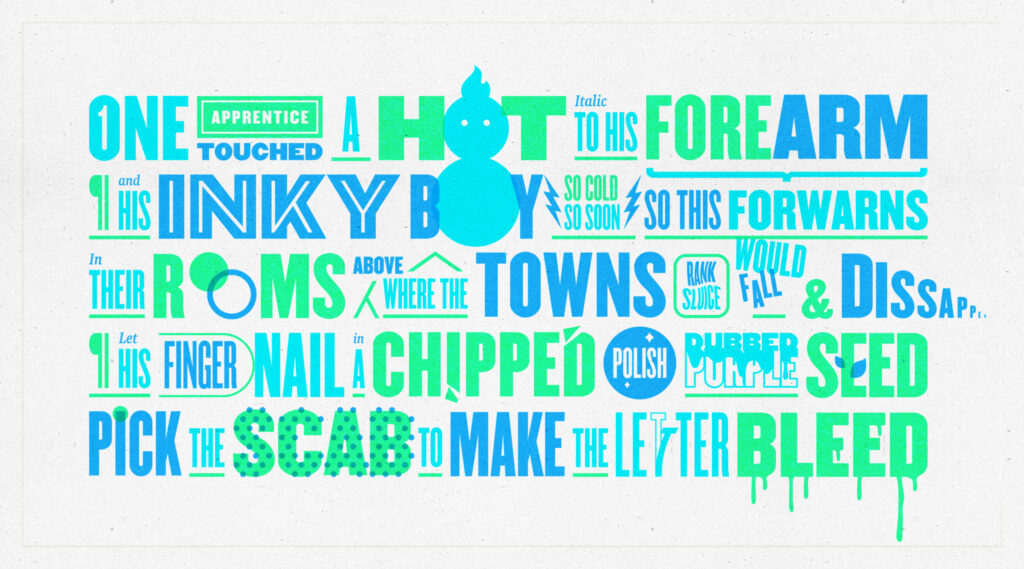
Workshop Challenge:
Take an excerpt from a national poet or writer and translate into a new typographic form.
Don't know what I was thinking here but I have found an Irish Poem about typography, so either I am making life easier or harder for myself. It's a pretty tricky poem to illustrate typographically but here goes. Chosen excerpt below:
CHOSEN POEM: AN ESSAY ON TYPOGRAPHY/KEVIN CANTWELL
Hopkins would say they fettled these flecks of light from alloy
as steel dust – these jewellers who cut letters of type from stock.
With a bird’s tongue file, they shaved the burrs and nicked
the chaff they puffed aside to make the slant font display
a book hand meant to imitate Petrarch’s script.
They set without kerning one wavering page of Nature
wedged in a proofing tray by wood-block furniture
and shimmed quoins – but first they waved each glyph
through candle flame, smoke-pressed it onto wet paper.
One apprentice touched a hot italic to his forearm,
and his inky boy, so cold, so soon, so this forewarns,
in their rooms above where the town’s rank sluice would fall and disappear,
let his fingernail, in a chipped polish dubbed Purple Seed,
pick the scab to make the letter bleed.
Issue 121 of the Poetry Ireland Review (2017).
CHOSEN EXCERPT
One apprentice touched a hot italic to his forearm,
and his inky boy, so cold, so soon, so this forewarns,
in their rooms above where the town’s rank sluice would fall and disappear,
let his fingernail, in a chipped polish dubbed Purple Seed,
pick the scab to make the letter bleed.
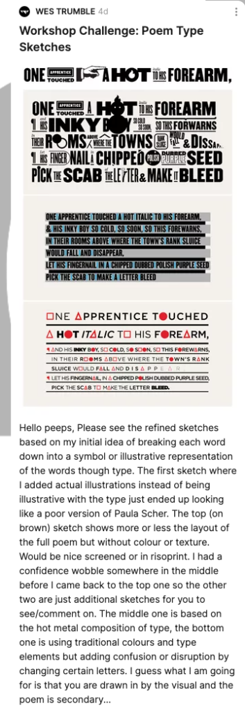
INITIAL SKETCHES
An exploration of my own interpretation of the given brief where I have broken down each word of the poem to illustrate the words individually. The idea is to create visual expressiveness much in the same way Dadaists approached typography where the message becomes secondary to the aesthetic.
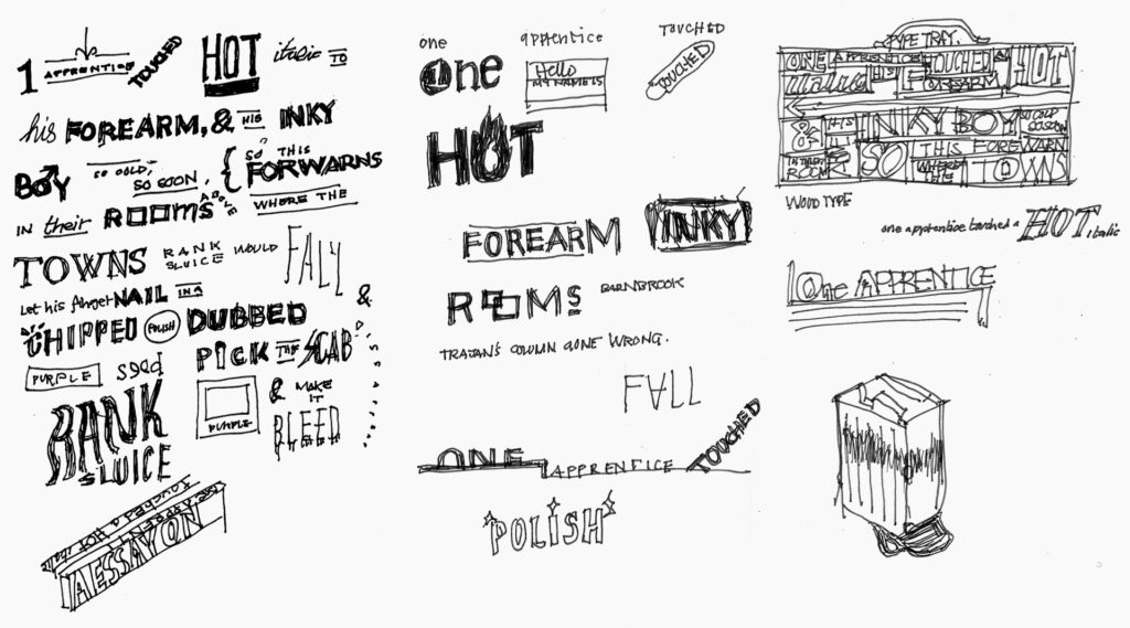
THE IDEAS WALL
At the time of posting there wasn't any feedback so I moved onto the next phase. Larry later commented on each treatment of the type almost being like logo's and while this is not really the intention I can see what he means. I liked the expressionism of the Dada type shown in the lectures and was trying to get some of that expression into my piece so it reads if you want it to but is essentially illustration with type rather than a direct link into readability of even legibility.
DIGITAL SKETCHES
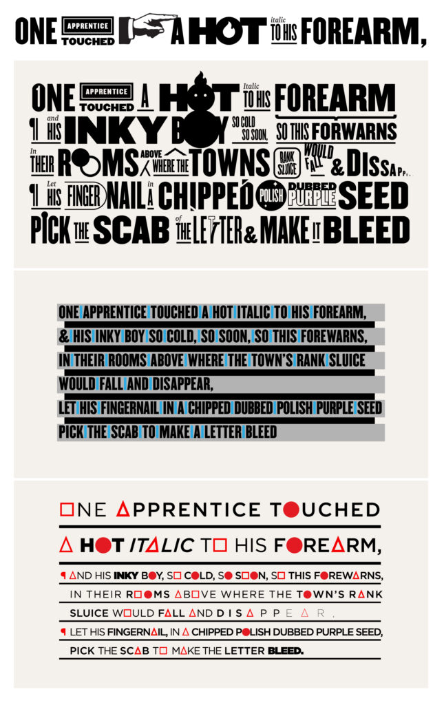
I refined sketches based on my initial idea of breaking each word down into a symbol or illustrative representation of the words though type.
The first sketch where I added actual illustrations instead of being illustrative with the type just ended up looking like a poor version of Paula Scher.
The top sketch shows more or less the layout of the full poem but without colour or texture. Would be nice screened or in Riso print.
I had a confidence wobble somewhere in the middle before I came back to the top one so the other two are just additional sketch ideas.
The middle one is based on the hot metal composition of type, the bottom one is using traditional colours and type elements but adding confusion or disruption by changing certain letters.
I guess what I am going for is that you are drawn in by the visual and the poem is secondary... Its conceptual and expressive typography for the viewer to engage with in a purely visual context.
THE IDEAS WALL
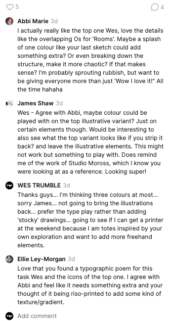
Great feedback from James and Abbie. I was looking to add colour to the piece anyway but tried to get the drawing of the type and balance right first. I have spoken to a printer about producing this in Riso so will try to simulate the brightness of this in my final rendering.
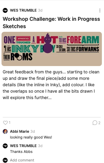
THE IDEAS WALL
Just posted one of the intermediate sketches to show the work in progress, colour and refinement of some of the details that I had in mind.
Workshop Challenge: Final Execution
The final piece with all the type detailed and colour/texture added. I like the colours I have chosen but think I can play more once I have this printed on the Riso machine for real.