Peer reflection, thinking by doing, testing and refining design
REFLECTIONS ON LECTURES AND SOURCE MATERIAL
—
LECTURE
Please identity and explain a development process / activity where you had to evolve a more revolutionary approach to solve a project.
From having no brief to applying different methods and processes both digital and analogue, the lecturers demonstrate in detail how to go outside of the client brief in order to find a solution creating and delivering unexpected results. This left of centre approach where Feld created a 'fake' machine learning tool to gather data, A+P algorithms for multiple strap line interpretations, or Studio Dunbars sound interactive algorithms are all exciting and valid approaches for developing unique outcomes. It demonstrates and acute understanding of the technology that's out there and how to use it in unusual and clever ways for creating both digital motion design and analogue graphic results and the work speaks for itself. Eden Spiekermann's forward thinking approach also focuses on how the design will live and work in the future answering the age old question of where a product, service or brand will be in five years and whether the project is scalable or not.
TAKE OUTS
— Think how technology can be employed to solve a specific problem in a new and exciting way.
— Go beyond the client brief or re-envision the creative brief completely.
— Futureproof the use of technology. Is the project scalable or will it date?
—
RESOURCES
Mitch Paone of DIA Studios focus is one of digital, coding and motion design. It was interesting that he highlights the fact that we are no longer working in a purely analogue space and that all things are connected whether analogue (still), sound, motion mapping, animation and interaction. Tri-Boro focus on the core message - how do you get soul into the work, consistency, personality and flexibility. As every detail of the process and work produced is self made I think this is where the soul comes from. Using pre-made graphic elements is not even an option for them. Mahaanoola echoes this to some extent in multi-faceted areas of photography, design, communication, film making, eventing and sound. Never staying in one area - a Jane of all trades and master of them all. This flex in her thinking allows for a broad outlook and she describes this process as breaking the box that others would like to put you in. Experimental Jetset broke the box when they started and in keeping a stict modernist approach to their typography have allowed themselves to constantly explore the idea and play. Paul Sahre's work feel's more ephemeral without being nostalgic and you can really feel his personality and sense of humour in the work produced.
TAKE OUTS
— We are working in a digital space and need to employ and be aware of everything that this encompasses.
— Sound and motion are intrinsically lined to each other.
— Message and idea are key.
— To create work with soul you need to put your soul, mark on the work created.
— Avoid the pre-made (stock etc.,)
— Look for ways to re-envision the pre-existing.
— Don't stay in an area you are comfortable with as the results will inevitably be the same.
— Think outside of the box... (hate this saying but understand its meaning).
— Keep it simple to let the idea come to the fore.
— Put yourself into everything you make.
— Design in the way 'you' want.
—
Carry out your own independent research into themes delivered.
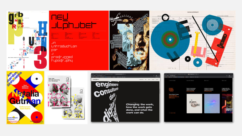
Up until now I would always have considered Studio Dunbar to be at the top of their game in terms of creating work that is left of centre and works in the digital space. Dutch design in general has a tradition of coming from a place of modernism from its inception, with designers such as Piet Zwart and Total Design's Wim Crouwel and Ben Bos leading the way. If you look at the early work of Piet Zwart, the type is in motion before motion design was even a thing and this is also true of H.N.Werkman. Wim Crouwel's typeface and poster designs predicted a digital future long before anyone else was even remotely working in this spac, while the early work of Gert Dumbar and Karel Martens pushed the distinctiveness of Dutch design even further. This willingness to dare to experiment, be brave and embrace the new infuses all of Dutch design right up to the present day.
—
Know that to make beautiful creations for the sake of their aesthetic value will have no social significance tomorrow, will be nonsensical self-gratification. Every era contains the conditions for providing a rebel.
Piet Zwart
—
Of course design is about problem solving, but I cannot resist addingsomething personal.
Wim Crouwel
—
Dutch design has always given me the impression that they are always looking sideways to find a solution, which I think this comes from the design schools and also in part, the general way that Dutch people and designers think about and experience the world. According to Rick Poynor "The question 'What is Dutch graphic design now?' is harder to answer than it used to be. As a result of inward-bound influences, combined with the openness to new developments of a small but highly successful trading nation, Dutch graphic design is probably more variegated and tougher to characterise now than it has ever been." (Retrieved from: https://www.creativebloq.com/graphic-design/fall-and-rise-dutch-design-21410643). However, you still get the sense through the work created by studios such as Koeweiden Postma and Experimental Jetset that this could not have been created anywhere else. They are often imitated, but never bettered. So what makes them think so differently?
According to Sebastiaan Scheer, design director at MediaMonks Amsterdam Dutch culture is paramount: …'Take our education system: they made the jump from traditional ‘Dutch Design’ to digital around twenty years ago, and the overall quality of education is high. Then there’s the fact that the Dutch always tend to stay ahead of trends and are quick to adapt. …The culture fosters openness, progressivism, and collaboration. It’s a country of entrepreneurs and freelancers. (Retrieved from: https://www.thedrum.com/opinion/2019/11/26/the-dutch-mentality-behind-digital-design-success).
What I love about The Netherlands is its openness to newness and its inclusivity. On the other hand, the Dutch are hard on themselves, quite critical, downplaying their work even when it’s just great. The upside of this attitude is that it drives us forward.’
Liza Enebeis/Studio Dumbar
—
Bert Hagendoorn, chairman of Dutch Digital Design, argues "We dare to experiment and our “nuchterheid” (sober, cool approach) and simplicity help designers [to] come up with creative, effective solutions. Crucially, because we’re a small country, we’re accustomed to working together. …Different cultures and disciplines, definitely gets you further." (Retrieved from: https://www.thedrum.com/opinion/2019/11/26/the-dutch-mentality-behind-digital-design-success). It is this constant drive to avoid sameness and find the distinctive, experimental point of difference that makes Dutch design unique.
—
Workshop Challenge
Communicate with peers, staff, research groups and industry professionals to clearly define the visual direction of your chosen project brief.
THE IDEAS WALL
Interesting to see that Ellie awareness of digital billboards in public spaces has increased. She doesn't say if this is a positive or a negative thing for her. I personally think it's an unavoidable area that we are heading into and as long as the technology can be employed across omnichannels in a passive way and not impose too much on peoples daily lives then it is a great method to draw in the audience.

THE IDEAS WALL
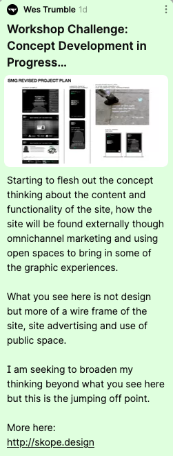
Rosie seems to like the concept direction I am taking. I haven't completely fleshed this out and it is not intended to be a final design solution - just a wireframe for the design outcome.
At this point in time (Tues 23rd Nov/18:34) I have been unable to get the feedback from my peers or the staff and as the next available tutorial is on Thursday I will have to push on regardless. I am hopefully going to catch up with some of my peers on the facebook group tomorrow.
—
Collaborate with key stakeholders to gather feedback and ensure that your project aligns with your target audience.
As our next discussion with John Stack is on 2nd Dec I will have to push on regardless.
RESULTS FROM ONLINE SURVEY (ONLY 2 PARTICIPANTS)
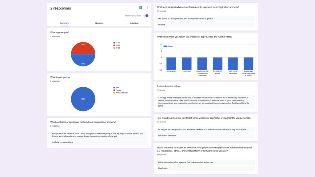
Unfortunately as only two participants filled out the online survey no quantifiable distinctions could be made.
—
Make prototypes and user test your design developments, to ensure your project direction is clear, concise and aligns with your target audience.
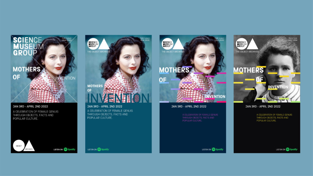
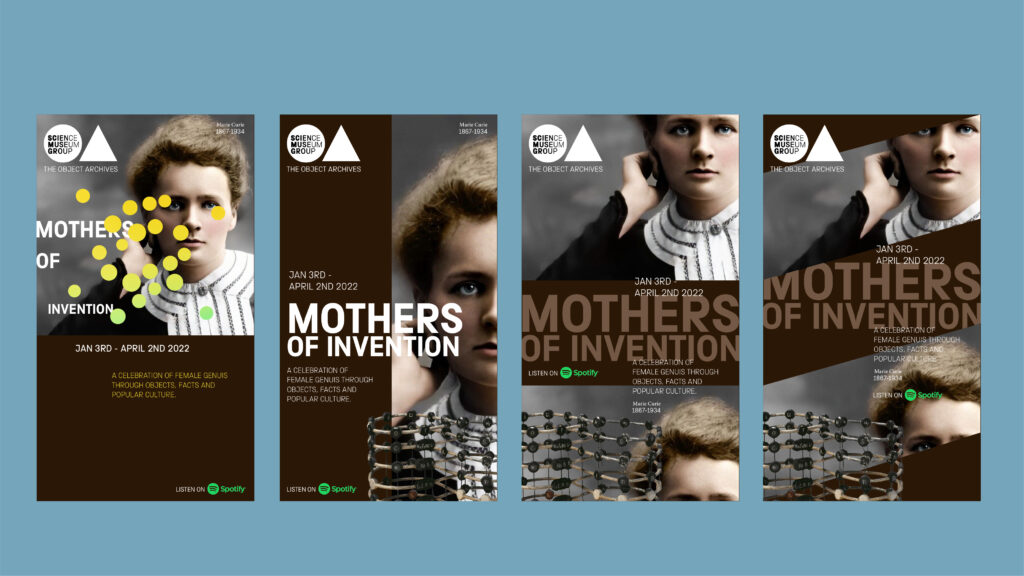
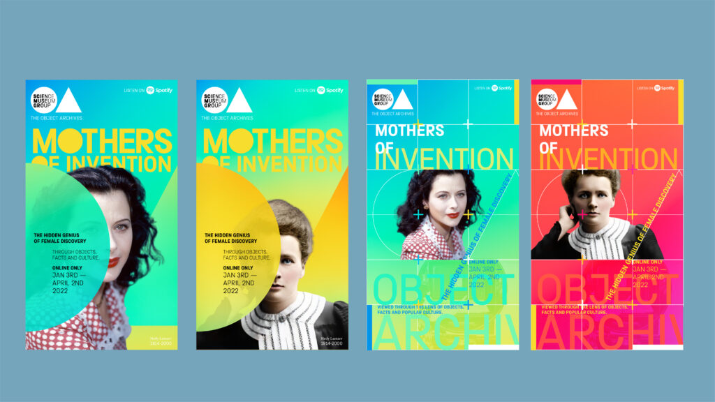
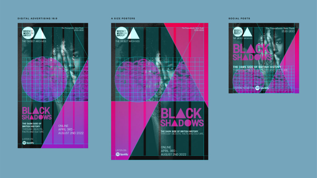
Had a great peer to peer chat with Allie and Ellie about my concept development and they both feel I am going in the right direction in terms of the level of intrigue I am creating with my visual look and feel and my approach to including objects within the external facing designs. I was concerned that I may have taken the focus away from the objects themselves as my archive is now targeted through online themed events that tie in with key dates such as Black history Month, International Women's Day and so on… They felt for them that my development of both a graphic look for the archive; taking the 'O' of object and 'A' of Archives and reducing them to their basic forms and the development of a typeface that echoes this was a strong direction and visually striking. They also liked the use of crops and the way I have included objects from the archive in my colour overlays (third board - last two options). We discussed the colours and agreed that the base colour of the digital posters needs to pop more so it is in keeping with the science museum colours so I will explore this further as well as looking into how I can create a modular system from the shapes to add 'consistency and flexibility'.
THE IDEAS WALL
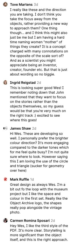
Really great response all round to the graphic look and feel of my digital posters and Tove, Ingrid, James and Carmen all think I'm on the right track as the objects are still included in theirs and my favourite concept (third board).
Tove made an important point about the language I use and I don't want to put off my demographic so I will think about this further.
James and Mark both like the circle and triangle for the Object Archive "sub-branding". Mark prefers the darker colour scheme though in talking to Abbie, Ellie and getting the feedback I have I think I need to maintain the vibrancy of the Science Museum gradients.
—
Design the direction of your project concept, utilising feedback from your prototyping and user testing results.
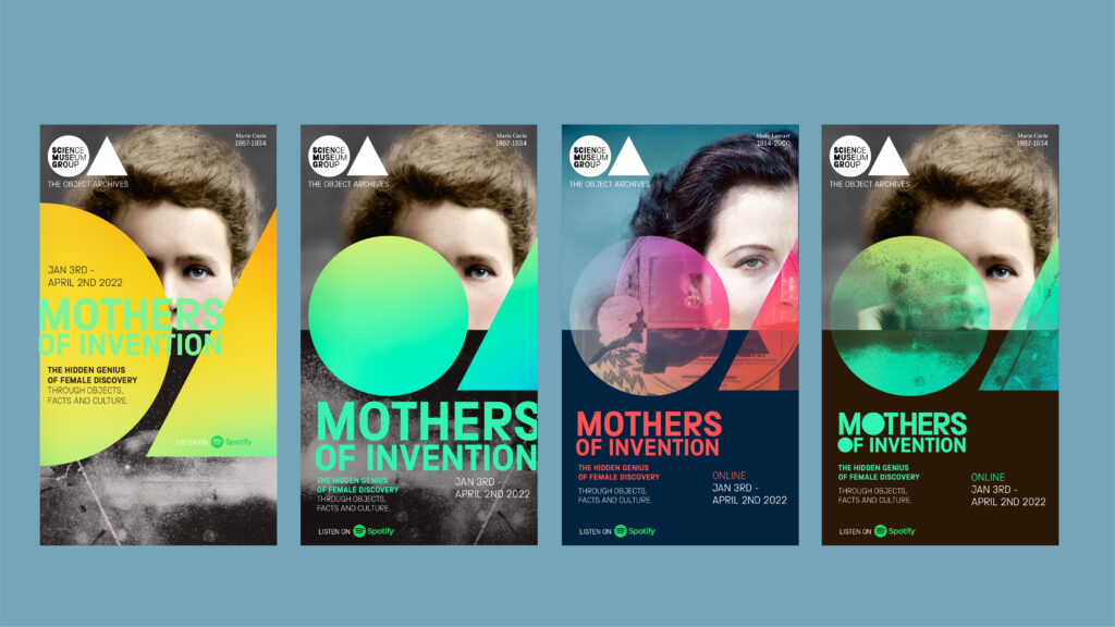
I have developed the concept further bringing in more of the vibrancy and colours from the SMG. I have also looked at how this system can come to life when applied in different ways to create that level of consistency but with inbuilt flexibility. Using a grid I can decide my crops and where the colour bands sit which makes room for more play with the layouts.
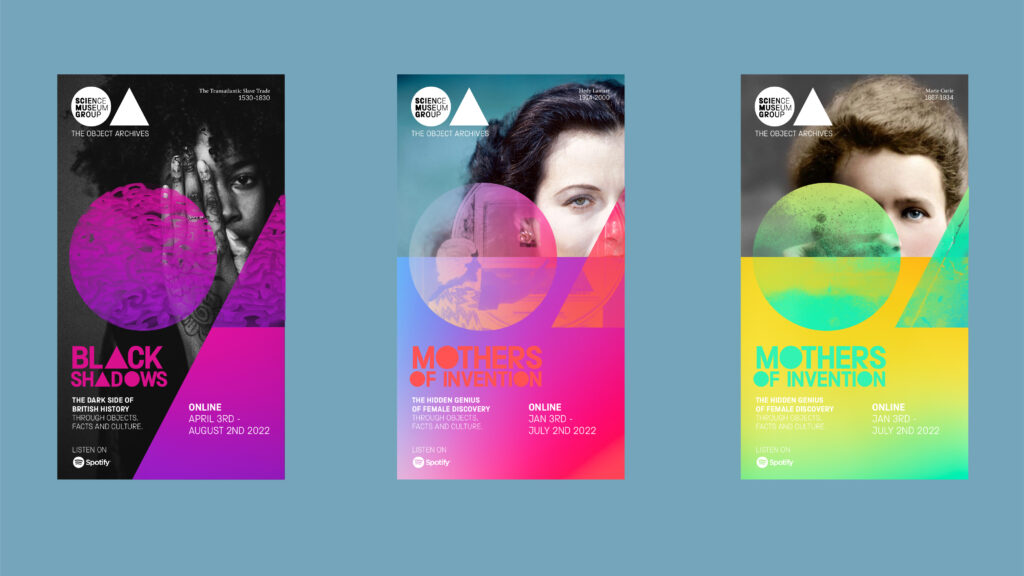

I am going to keep prototyping and want to get into bringing the website, digital posters and street art to life next week.