Reflecting on Classic Models for Graphic Design Working
REFLECTIONS ON LECTURES AND RESOURCE MATERIALS
L1: DESIGN TO CHANGE THE WORLD
In this weeks lectures we explore the many ways in which designers can form collaborative relationships with stakeholders outside of their field, opening up a world of possibilities that hopefully results in the creation of new and interesting work.
The collaborative process can still be driven by specific project requirements. For instance in Offshore's case they have set parameters that must be met for each issue of Migrant magazine such as the well researched mono-thematic subject matter. However, once this subject matter is decided upon they bring in third party expertise to create visual and verbal content that supports the research thinking and the theme. The publication has rules in terms of typeface, font sizes, grids, paper stock, colour use, metallics etc... but generally speaking the content is curated/created by third party contributor's with editorial guidance by Offshore. These third parties are not stakeholder's as such but experts in their own field whether it be artists, photographers, curators, academics etc... who analyse, research, write, visualise and create appropriate content for the magazines editorial team to review. Offshore trust in the partnerships created, employing a non-hierarchical interactive process that allows for democracy and diplomacy between parties. They also self promote through digital media, symposiums and events to look for and recruit more contributors.
In Morag Myerscough's and Lemm Sissay's case, the families and patients of the UCLH became their collaborators and key stakeholders. Morag conducted visual workshops with the patients which helped inform the colours and typography choices, and Lemm spent time with patients and their families to compose poetry for the spaces; the collective approach being one of sensitivity. It was touching to hear about how the seriously ill children could not always participate in the process of designing their spaces, albeit the pathways and seating areas outside of the main wards; because of the stages of their conditions. The stakeholders in a process like this are nurses, doctors, general staff, management and architects. However, beyond the day to day cleanliness and functionality that a hospital requires - it is ultimately the patients and their families that have to 'live' in the space.
In proposing designs for children's hospital bedrooms in Sheffield, Morag took the approach that the bedrooms should feel like home; bringing in warmth, pattern and liveliness. The nurses initially hated the designs which nearly halted the project altogether, so it was interesting to hear how Morag brought them on board. She created 3D models of the rooms to present both the materials used, and the colour schemes proposed, to all stakeholders including the families, patients and nurses. This approach made the spaces easier to comprehend and they were universally loved, especially by the families and patients, which ultimately led to the projects realisation.
TAKE OUTS
— The collaborative process can be informed by a theme, or structured design format. (Specific project requirements).
— Choose the right people to collaborate with to play to your strengths.
— Designer's should work with collaborators outside of their field. Experts: artists, photographers, curators, academics etc...
— There should be give and take in the relationship allowing for diplomacy and democracy.
— Listen to all parties and find clever solutions to seemingly intractable problems.
— Comparing like for like (field trips) can aid the process if the project stalls.
— The end of a project is not the end. Monitor a projects journey beyond the implementation to measure its success or failure.
...
L2: GRAPHICS THAT ENGAGE
Ken Hato employs the use of technology to enable participants the ability to create generative graphic design assets that are used to inform a brands visual language. Whether working with children to create alien pictograms for a 'space bus' or developing a mark making application for followers of the D&AD to submit doodles, this co-creative, co-design process results in work that is both human-centric and instantly socially shareable. This open-source, generative approach allows for user participation producing a variety of unexpected and interesting expressions, but I feel it can be lacking somewhat in the editorial process but perhaps that is the whole point. A democratic, human-centric open approach with attribution to the design 'pictograms' created. The control freak in me wanted to select and curate the best outcomes.
For the Middlesborough Art Museum, Kelenberger White's process was informed by field trips which lead to connecting the Middlesborough of today to its industrial past. To some extent this project was collaborative in its research and fact finding, but not so much in its design approaches as they had clearly defined where the industrial paint colour palette would come from and what form the typography and grids of the project would take.
TAKE OUTS
— A democratic, ethnographic and human-centric process allows for participation, vested interest and ownership for all parties.
— A generative process creates unexpected outcomes.
— Field trips unlock both the past and the present and concepts for the future in ideas, materiality and colour.
— Giving over control and the tools to participate is both democratic and diplomatic, and the designer should take on the role of a facilitator.
— Allowing play brings us closer to the act of making.
— Design should act as a filter for the process.
— The designer's responsibility is to reflect and represent the community involved in a curatorial role.
...
L3: REFLECTING ON CLASSIC MODELS FOR GRAPHIC DESIGN WORKING
In both of Pearl Fisher's projects they used locally sourced image makers to collaborate on regional or human-centric themes. By cleverly engaging local artisans to realise the vision they were able to connect with regional audiences. This was achieved by tapping into local knowledge and visual culture. It also provided an additional dimension for the brand story in the retelling of the artisans own personal stories. In the examples presented both groups were tasked to create a series of 'assets' that combined to tell a bigger story, be it the culture and vibrancy of Cuba or the modern take on Irish folklore. This resulted in a mix of hand-made and technical elements coming together to create a coherent visual language which was then curated by Pearl Fisher to realise the finished brand.
TAKE OUTS
— When working on a culturally specific brief local artisans can be employed to enhance the outcome.
— A clear brief can act as the framework for experimentation and play to take shape.
— The designer should facilitate and act as a filter for the brand to have a consistent and coherent voice.
...
RESOURCES
TAKE OUTS
— Identify who you want to collaborate with: Photographers, illustrators and set designers. Will they add visual resonance and depth?
— Collaborate with brands that align with your thinking.
— Don't compromise on your ethos.
— Curate workshops to unlock the potential of design from your collaborators.
— The guidance you give can act as a loose framework for creativity to take place. (Facilitated process).
— Collaboration with communities means that you will make things that people want.
— Opposing skillsets can bring about unexpected results.
— Work with people who are better than you.
— Collaboration brings more out of you and your collaborators.
—
Workshop Challenge
What are the essential components of the collaborative mix?
Find one example of collaboration past or present that has led to an exemplary and historically significant piece of work.
- Analyse the relationship of the collaborators and the roles they played;
- Research any documented history of the challenges they faced and the outcome they produced;
- Explore and analyse any specific approaches they took to their creative process or recording of their ideas that facilitated a successful outcome.
Design as an editorial piece (300 words), along with accompanying imagery.
...
I Looked at a few collaborative partnerships that resulted in long stand, visual representation and significance to a specific place and time.
These included:
— Sergeant Peppers: The Beatles, Peter Blake and Richard Avedon.
— Never mind the bollocks: Vivienne Westwood, Malcom McClaren, Jamie Reid and The Sex Pistols.|
— Joy Division's Closer: Peter Saville, Tony Wilson, Rob Gretton Martin Hamnett and Joy Division.
— Gorillaz: Jamie Hewlett, Damon Albarm et al...
— The first plywood chair which evolved into the first designs for Vitra: Charles and Ray Eames.
— Apple Computers: Steve Jobs and Steve Wozniak.
— Penguin Books: Allen land and Jan Tschichold.
I have chosen to research Penguin Books and the relationships between all parties in the realisation of a design classic.
RESEARCH
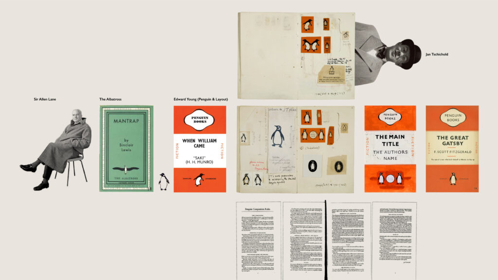
In 1934, on his way to London after visiting his friend Agatha Christie, the young publisher Allen Lane stopped at the station bookstall at Exeter St Davids and saw that the books on sale were of a poor quality and overpriced. What was needed, he realised, were good books at a price everyone could afford. Within a year he had founded Penguin Books, creating a paperback revolution that would sweep the world (1).
He was inspired to create the sixpenny paperback (1), or at the time a book that was the same price as a packet of cigarettes (2). At the time, this was revolutionary. On a mission to make good quality books affordable and accessible to all, Sir Allen Lane arguably propelled the profile of reading and made it a pastime that everyone, regardless of their background, could enjoy (1).
“We believed in the existence in this country of a vast reading public for intelligent books at a low price, and staked everything on it” (1).
It was in fact Sir Allen’s secretary, Joan Coles, who suggested the penguin when he expressed his desire for a “dignified but flippant” symbol for his new publishing endeavour (1).
She had apparently overheard a naming meeting and all other names were rejected (3).
Along with his brothers, Dick and John, Sir Allen decided it would be called Penguin Books (1).
21 year old Edward Young was then sent to London Zoo to draw the bird that would become one of the most recognised brands in the world (1).
"Teddy" Young, (17 November 1913 – 28 January 2003), was a British graphic designer (4).
After attending Highgate school, north London, Young went into publishing, working his way up at Bodley Head to designing dust-jackets, for which he showed a natural aptitude. This was remembered by Allen Lane when, in 1935, he resigned as managing director to effectively invent the modern paperback (5).
Reportedly he returned from this job with the comment "My God, how those birds stink!" (4).
Young was then asked to design the covers of the first set of ten paperbacks to be published in summer 1935 including Ariel and A Farewell to Arms (2).
Considering illustrated book covers to be trashy, Lane insisted on his following a simple horizontal grid for Penguin’s jackets (2).
Along with Lane, Young also devised the colour schemes used by the firm on book covers; orange/white/orange for novels, green for crime and detective novels, and pale blue for the Pelican series (4).
The rigorous application of colour, grid and typography in those early paperbacks instilled Penguin with a commitment to design from the start.(2)
The logo he drew appeared on all Penguin books until 1949 (4).
The fact that the symbol for Lane’s new publishing concept was a sea-going bird owed much to the contemporary publishing scene on the continent and, in particular, to the German reprint publishing house Albatross, which had been founded by Max Christian Wegner and John Holroyd Reece in Hamburg in 1932 (6).
The unfussy covers were designed by Hans Mardersteig, art director of the Mondadori printers in Italy. The format of the Albatross paperback adopted the ‘golden ratio’ and various distinctive colorways to indicate the various genres—both techniques that were later picked up by Lane—with yellow for psychological novels and essays, orange for short stories and humorous works, and red for adventure and crime stories (6).
Penguin publisher Allen Lane recognized Albatross’s effectiveness in using design to establish a brand identity in the marketplace, and he wanted Penguin to do the same (8).
—
The enduring principles of Penguin’s design were defined by Allen Lane when he founded the company in the mid-1930s, but it was not until the late 1940s that it adopted a disciplined and coherent approach to design under Jan Tschichold. Already established as an eminent writer on typography and a famous practitioner by the time he arrived at Penguin in 1946, Tschichold was more assertive at imposing his design philosophy than his predecessors (2).
Before his arrival the design of individual books had appeared cohesive, at least compared to those of rival publishers, but had varied with the views of the editor and printer (2).
Tschichold began work by circulating written comments and criticisms about existing Penguin examples to the editorial staff (8).
A firm believer in typographic systems, Tschichold designed a template for all Penguin books with designated positions for the title and author’s name with a line between the two. He unified the design of the front, spine and back and redrew Edward Young’s endearingly amateurish Penguin symbol in eight variations (2).
What we now identify as a classic Penguin cover was designed by Jan Tschichold in 1946. The uniform cover design that remains iconic today (1).
He then developed the “Penguin Composition Rules,” the standardized formats and typographic specifications which addressed text composition, indenting, punctuation marks, spelling, capitals, small capitals, italics, folios, figures, references, footnotes, make-up, and the printing of plays and poetry. The Penguin composition rules, which ran to four pages, unified the design of all series while bringing harmony and economy to its publishing program (8).
Underlying the Penguin Composition Rules was the implementation of a grid system. The grids were unalterable instructions that set the foundation for the trimmed page area, width and height of each book, visual cover size, type area on cover and spine, position and style of the spine label and lettering on labels for all the Penguin series (8).
After establishing these design standards, Tschichold had the responsibility of explaining it to the large group of Penguin Books compositors and printers, many of whom were less than enthusiastic for the intensified level of scrutiny and involvement in their work (8).
During the 1920s and 1930s The Monotype Corporation, under the direction of “typographic consultant” Stanley Morison (1889-1967), raised the standard of British publishing and printing by reviving a series of classical typefaces for machine composition. By the time Tschichold arrived at Penguin Books, the setting of type by machine had become an accepted practice by printers and publishers, as composition machines had become more proficient and books composed and printed by mechanical means were considered as superb as those created by hand. The revolution of mechanical production moved quickly through the printing trade as composition machines became more proficient (8).
What Tschichold did for Penguin was to raise the level of text typography through his patient and persistent haranguing of printers across the country, and his insistence upon a way of doing things which was far more systematic than anything most of them were used to. The fact that Penguin used printers throughout the country meant that those ideas were then spread far more widely that he may have thought at the outset (7).
Tschichold was equally rigorous in the design of special sets of books published by Penguin. These included Penguin Modern Painters, introduced in 1944 by the art historian Sir Kenneth Clark to popularise modern art to “the wide public outside the art galleries”, and the Penguin Shakespeare Series, which had the same democratising objective for William Shakespeare’s plays. Among Tschichold’s innovations was to persuade Allen Lane to allow Penguin to take advantage of recent advances in printing by using illustration on the jackets of particular sets of books such as the Shakespeare Series (2).
Tschichold personally designed over 500 books in three years at Penguin Books (1).
In 1949 Tschichold returned to Switzerland after three highly productive years in which he had defined an intellectually rigorous and inspiring visual language for Penguin, ensuring that ‘its books, produced as cheaply as possible in millions for the millions, are every bit as well set and designed as the most expensive in the country’ (2).
—
The only problem is that Tschichold’s rules were created for an era in which manual typesetting, letterpress printing and traditional bookbinding were almost universal. And, perhaps more importantly, Tschichold could not have anticipated today’s environmental crisis. Penguin Books currently prints around 600 million units every year – a simple calculation shows that this translates as 1.5 million trees (9).
By identifying a series of recurring extraneous spaces throughout Penguin’s catalogue, …a significant number of improvements to the publisher’s Composition Rules …could save thousands of trees annually (9).
The primary function of the half title page was to prevent the inlay from getting dirty before the book’s cover was attached. Modern techniques make this unnecessary; removing it saves two pages per book (9).
Similarly, although starting a chapter on a new page is aesthetically pleasing and gives the reader a little reward after finishing a chapter, if we waive this reward, empty space can be eliminated and pages saved (9).
Using an em-space is a clear indication of a new paragraph, but it also leaves an unfinished line. A black square could be used instead to indicate the start of a paragraph – this would be visible and also saves space (9).
If only one major publisher changed its routines, this could translate into around 202,500 trees per year. And, if more companies followed suit, entire forests could be saved (9).
...
1) Retrieved from: https://www.penguin.co.uk/articles/company-article/celebrating-sir-allen-lanes-life-and-legacy.
2) Retrieved from: https://designmuseum.org/penguin-books#.
3) Retrieved from: https://www.sirgordonbennett.com/gordons-bugle/penguin-book-design.
4) Retrieved from: https://en.wikipedia.org/wiki/Edward_Preston_Young.
5) Retrieved from: https://www.theguardian.com/news/2003/feb/04/guardianobituaries.books.
6) Retrieved from: https://www.bloomberg.com/news/articles/2014-06-04/the-story-behind-penguin-books-beloved-bird.
7) Retrieved from: https://www.eyemagazine.com/review/article/the-wrong-browsers-extract.
8) Retrieved from: http://en.izhsh.com.cn/articles/10/1_195.html.
9) Retrieved from: https://www.iconeye.com/opinion/rethink/the-penguin-composition-rules#:~:text=In%20the%20late%201940s%2C%20the,catalogue%2C%20both%20functionally%20and%20aesthetically.
—
Final Outcome
COPY
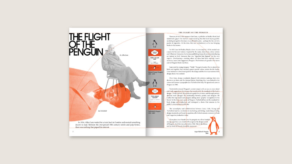
THE FLIGHT OF THE PENGUIN
In 1934, Allen Lane waited for a train back to London and wanted something decent to read. Between the over-priced 19th century novels and pulp fiction, there was nothing that piqued his interest. However, it was at this moment that Lane, a publisher at Bodley Head, had identified a gap in the market, understanding that the book buying public needed good quality literature at an affordable price - perhaps for the cost of a packet of cigarettes. At the time, this was revolutionary as he was bringing books to the masses.
In 1935 Lane left Bodley Head to form his own imprint. All he needed was a name for his new venture. Inspired by the name, clean lines, colour system and ‘Albatross’ character of a German publishing house; he set about developing an ‘animal or bird’ character that was “dignified but flippant” for his own imprint. Overhearing a meeting where all ideas had been rejected, Lane’s secretary, Joan Coles suggested a Penguin. His brothers all agreed on the name and so Penguin Books was born.
Lane sent his young designer, “Teddy” Young to London Zoo to sketch the birds and together they devised a genre specific colour system for the books. Lane insisted on a horizontal grid for the design and the first incarnation of this design classic was realised.
Over time, design standards slipped, with printers making their own decisions on fonts and the internal layout. Realising this, Lane looked to the renowned German typographer Jan Tschichold for help. He agreed and came to Penguin in 1946.
Tschichold reviewed Penguin’s current output with an eye on every detail and made suggestions for changes that would unify the standards of the book's design - inside and out. He produced a guide for printers, and through patient, detailed work changed the relationship between printer and designer. He crafted the logo mark and penguin adding more ‘graphic’ recognition to the brand. In the three years spent at Penguin, Tschichold had set the standard for book design and production and redesigned a classic that remains in the public’s consciousness to this day.
The serendipitous moments and collaboration between Lane, Cole, Young and Tschichold lead to a revolution in marketing, publishing, readership, printing, design standards and brand recognition; all of which remain constants in book and magazine production today.
If you place your thumb over the penguin on a three banded orange paperback you would still recognise the design as that of Penguin. And this was achieved in 1946. This is the litmus test by which all brands should aspire.
...
VISUAL REFERENCE
...
SKETCHES
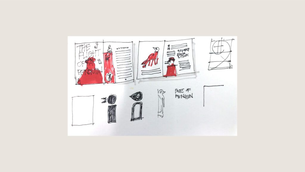
PROPOSED LAYOUT
I looked to create something that had visual links to Tschichold's earlier work as well as the work he created for Penguin. Precise, clean, considered with a touch of asymmetry.