
Designer, Author, Maker: Case Studies Exploring Trends and Outputs of Influential Studios
REFLECTIONS ON LECTURE AND RESOURCE MATERIAL
INTRODUCTION
Suzanna highlights two specific areas of design authorship:
‚— A designers own selection based on observation, engagement and an understanding of the world around them.
or
— An idea where a specific need has been identified.
Michael Rock describes this in his Eye Magazine article (Designer as author) as the "murky territory that exists between design and art".
...
LECTURE
In Craig Oldham's lecture he outlines his own take on authorship, graphic design as a service industry practice, and the role of the designer in creating work for clients as well as the self initiated. He defines design in the world at large as largely being a service based industry where the role of the designer is not to particularly like the work in order to find a creative solution. This also highlights the fact that the designer should think outside of their own concerns and that the work created is not self expression but an answer to a specific problem posed. I agree with this in terms of service industry design as you are tasked to answer a specific brief, respond to market research, design for a specific audience and the work needs to answer the specific needs of the client. However, you can question the process, rewrite the brief and even find a pattern within the research that is the path less followed by market competition.
He also applies this approach to the self initiated in his own work and, from his own personal perspective, the work should have an underlying purpose and inherent meaning. I think this is an important point to make and separates designer as artist from designer as founder and maker.
—
"Without having something to say, and the courage to say it, the best design in the world will not save you".
Craig Oldham
—
He views the role of the designer as author as a curatorial process whereby content is gathered that will support your area of interest. In other words the researching and gathering of content gives context, meaning and purpose to the work.
He outlines some key questions the designer should ask themselves as part of the overall process:
— Why are you doing this? Look for a meaningful answer.
— Who is it for? (Audience/For Yourself?)
— Who is the client?
— Is it worth pursuing?
— What is it's meaning and purpose?
— Are you using creativity for good? (Ethical, social, political and environmental concerns)
— What are you trying to convey?
— Are their any stakeholders/collaborators that will connect with the material?
— How does the detailing relate to the content? (Graphics/Finish)
— How does it align with your own principles and practice? (Ethics, Goals)
...
RESOURCES
In Michael Rock's Eye Magazine article (Designer as author) he argues much in the same way as Craig Oldham that design authorship should 'counter the perception of a designers individual brilliance' and that designers should produce work that 'releases a single meaning or central message'. In other words this is not design in a vacuum devoid of any meaning, nor is it design as art. It is design with purpose that addresses a specific need. The designer as author should invent, construct and found ideas that make things better.
Michael also takes Craig's view that the designer should concede overarching control within the curatorial process to allow other voices to come to the fore. Michael points out that the old sense of authorship meant that an individual would originate and give existence to everything'. Today the designer author should not have totalitarian control over creative activity. He points out that when your become part of a wider collaborative process authorship is blurred. In this instance ethnographic practice comes into the mix and it is important that the data does not become not skewed or biased. Michael says "designers would need to produce large bodies of work (to see) where patterns emerge" if this becomes the case.
Andrew Saris, in writing about the pillars of authorship in film making, asserted that the author should have a stylistic vision, be consistent in their vision and that the work should have interior meaning. The primary concerns for the designer as author should be: what does it do? how does it do it? and what form does it take?
...
Workshop Challenge
RESEARCH
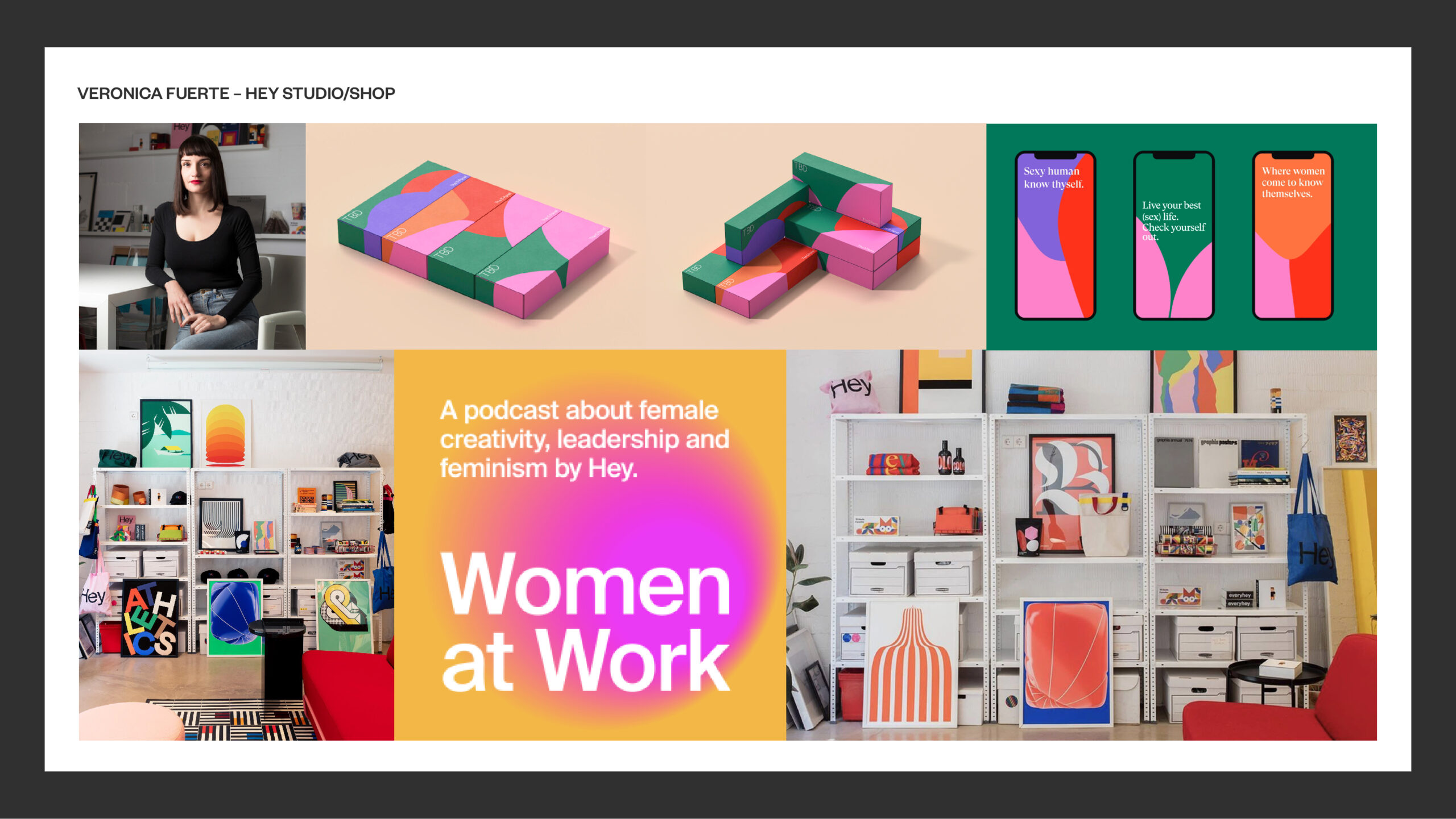
Verònica Fuerte/Hey Studio
Verònica Fuerte founded her small studio, 'Hey', with a visual mindset (2) in 2007 and later 'Hey Shop' which are both based in the vibrant city of Barcelona. She is a true believer in the power of visuals for change (4). According to the Hey Studio website the business is focused on creating visual languages and strategies for a global client base with an eye firmly on the audience (2). Verònica points out that "brands should also consider how they talk, how they listen… A brand should feel like a person" (4). I think this is an important distinction because brands are for a particular audience and built specifically for people participation and engagement.
Her studio is less focused on aesthetics and uses the power of design to convey meaning and purpose (2). She uses research to help her understand the client better and to find ideas and inspiration asserting "The more information we get, the better we can design" (4). I also believe this to be true and that if you don't ask the right questions or conduct your own research the resulting work becomes style over substance. Veronica's mission was never to have a business that was 'solely about design. She also wanted to craft new ways of talking, managing and constructing a team' (1). In her first year she worked hard to define her core pillars for the business 'making sure the incentives, reasoning and drive behind her studio were solid (1). She simply asked herself 'what do I want to do?' (1). This is something I am personally commited to answering myself, however I find a few obstacles in my way due my age and also coming from industry based practice. A creative kick start is required. Her four pillars for the business were: playfulness, determination, communication and creativity (1). In developing visual languages, 'timeless simplicity' is also added to the mix which is reflected in the work produced. This need to simplify is something I am building into my own practice. She has built a business construct that is 'full of work that centres on the use of bold colours and shapes – across brand campaigns, illustration-focussed projects and personally driven initiatives crafting a playful, friendly style in a design world that can so often be intimidating and exclusive' (1). Boundless thinking without limits is encouraged (2) driven by a passion and curiosity to explore new ideas (4). She also believes that you should "fight for the riskier / ground-breaking ideas to be put forward by the client" (4). This not settling for the easy option is something I have always tried to instill in my own work and I always try to push myself out of my comfort zone.
—
“I always say ‘I want to be the leader that I never had, so that was my motive, to create a place I really wanted to work in.”
Verònica Fuerte
—
Verònica's parents were both hard working entrepreneurs and seeing this growing up gave her the drive to start her own business. I think by having parents that were both entrepreneurs has helped her develop the thinking behind where she has ultimately taken her business. After a short period working within the design industry she "felt that I needed to stop and try my own way of working and find my personal style" (4). Initially she focused on working within her means, working from home, and set goals for growth year on year (1). Four years in and the team had grown and had gained its first international client (1). The studio then moved to its own building in Barcelona and has gone from strength to strength.
She invests in her staff with coaching and therapy. This is not always present within our industry. Learning technical aspects of design is one thing but being mentored and having your mental health considered is key to the growth of any young designer. She also places high emphasis on “soft skills” – like leading with empathy when interacting with clients and fellow colleagues (1). She asks her team to take personal ownership of the pillars of the business: playfulness, determination, communication and creativity (1), and these values are expressed through the work of the studio, in the self initiated and in less informal gatherings such as studio meals, picnics and on social media. I.E: The team have been known to dance on TikTok. I am slowly starting to catch up with how to use social media effectively for promoting your practice and personal experience and insight seems to connect more than just showing your work. Side projects are also a must at Hey, which allows the team to break free from the confines of commercial projects (4). This is something I need to grow myself.
—
“If you don’t enter a project with playfulness, you’re not going to enjoy it. If you don’t go in with determination, you’re not going to get where you want.”
Verònica Fuerte
—
Her dream projects are ones “that have the potential to change some part of our everyday life” (1). In this weeks lecture this was a recurrent theme in all the examples shown. As a feminist in a male-dominated industry (3) she also loves projects that help women and women's social, political, environmental and ethical advancement. An example of this was Hey’s branding for the health start up TBD, an affordable at-home STI testing kit, which is “made by women, for women,” an essential medical option previously absent in the United States (1). Her feminist philosophy has also lead her to talk to female leaders within the design industry in her podcast 'Women at Work' (1). On the podcasts success, Verònica asserts “We’ve started to feel like we’re part of some change,” Verònica says, “A tiny part, yes, but we do feel it.” She is also a firm believer in equal opportunities and inclusivity.
In creating a strong visual identity that helps 'Hey' stand out from the crowd, the studio has gained worldwide recognition (3) building fresh brands, conceptual communication campaigns and unique illustrations for a wide range of clients, such as Uniqlo, The Wall Street Journal and Paypal (4). However, she also believes in the self initiated which led to the development and opening of Hey Shop. Hey Shop is a vehicle for the creative expression of the studio that sells posters, tote bags, books and notebooks with colourful, geometric designs (4) both online and in their physical shop in Barcelona. "None of this time is wasted because, it makes your commercial work better - They are interconnected and they feed into and off each other, however the balance between creativity and profitability is something that you need to be conscious about." (4). I also think this is important in developing your own voice and style.
Sourced and edited from:
1) https://www.itsnicethat.com/features/hey-veronica-fuerte-movers-and-makers-graphic-design-mailchimp-and-co-partnership-171122
2) https://heystudio.es/values/
3) https://www.martinaflor.com/75-veronica-fuerte
4) https://designwanted.com/interview-veronica-fuerte-hey-studio/
—
Sacha Lobe/ L2M3 and Pentagram
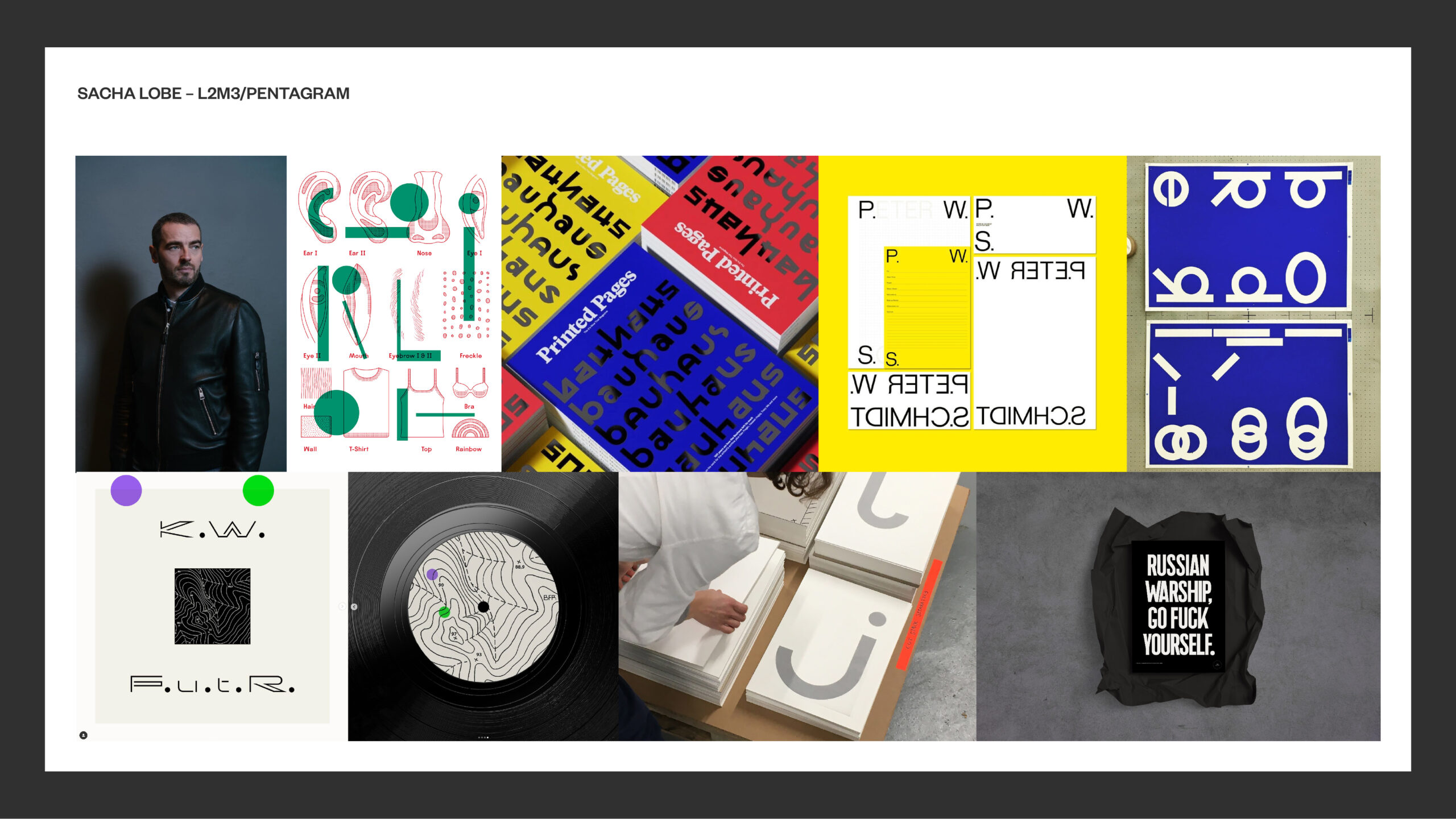
Sacha Lobe, now a partner at Pentagram, founded his practice L2M3 in 1999 in Stuttgart with the focus on graphic design for architectural spaces and cultural institutions exhibitions.1 This approach aligns with my current thinking about where to take my own practice. The studio created wayfinding systems, signage, print, branding and identity projects for high profile companies and institutions, the most famous of these being the teams corporate identity system for the Bauhaus-Archiv in Berlin in 2014.1 I visited the Bauhaus for the first time in 2019 and the visual impact of the understated design aligns perfectly with the Bauhaus's minimalistic approach to design outcomes. Less is more indeed.
As a partner at pentagram this work continues to this day with work both for Pentagram and L2M3 clients in Dusseldorf, Berlin and Stuttgart. Whilst working for both companies he has continued to involve himself in self-initiated projects which also aligns with his experimental approach to typography and continued interest in design in general.2 Personally I feel that this is something lacking in my practice and I need to allow myself the time to experiment and explore my own approaches to reframe my voice in design. He doesn't have a website to promote himself personally but a tumbler page which shows both finished work, work in progress, experiments and examples of things he likes personally or is influenced by.
Studying electrical engineering while a college he soon became frustrated with the physics and maths involved and looked to find another path either in architecture or graphic design, choosing the latter.2 Originally I was looking to move into printed textiles and also found that graphic design offered more avenues for self expression and multiple outcomes. He views himself as a traditional graphic designer with an interest in architecture and sign systems. His approach is minimal, grid-based and with a focus on typography having designed many of the fonts he uses himself.2 He views the grid as an underpinning structure that can also be loosely interpreted to produce artistic representation with a focus on context and meaning in designing appropriate outcomes.2 I also love the minimalistic approach to design with my favourite periods of design being the interwar years but have yet to built this into my own projects.
In terms of his self initiated projects they more often than not take the form of posters, some of which can be purchased online at Made-Ready.3 He has also created record sleeves for Kamaal Williams, has worked with XPatrick Thomas in Berlin and contributed to Soiree Graphique. The experience in September 2022 with XPatrick Thomas changed my view towards generative design and I hope to use more tools to create random outcomes that can inform my practice. More recently as a response to the start of the war in Ukraine he designed a poster using the last communication on 25th February 2022 by Ukrainian border guard Roman Hrybov when asked to surrender by a Russian missile cruiser Moskva while defending Snake Island. All funds went to the UNHCR, the UN Refugee Agency to help support the Ukranian crisis. 4/5.
Sourced and edited from:
1) https://www.pentagram.com/about/sascha-lobe
2) https://www.pentagram.com/news/an-interview-with-sascha-lobe-pentagrams-newest-partnerSour
3) https://www.make-ready.co/portfolio/sascha-lobe
4) https://en.wikipedia.org/wiki/Russian_warship,_go_fuck_yourself
5) https://peopleofprint.store/products/russian-warship-go-fuck-yourself
...
Following on from the case studies of both Veronica Fuerte and Sacha Lobe I want to bring some of my own personality in my outcome for this module. However, I also feel that whatever the outcome, it should have focused meaning and purpose underpinning the work. I refer back to Craig Oldham's approach to self-initiated project building:
— Why are you doing this? Look for a meaningful answer.
— Who is it for? (Audience/For Yourself?)
— Who is the client?
— Is it worth pursuing?
— What is it's meaning and purpose?
— Are you using creativity for good? (Ethical, social, political and environmental concerns)
— What are you trying to convey?
— Are their any stakeholders/collaborators that will connect with the material?
— How does the detailing relate to the content? (Graphics/Finish)
— How does it align with your own principles and practice? (Ethics, Goals)
...
Generate 10 ideas for discussion.
I am approaching the artefact from a social, political, environmental and human centric perspective that will hopefully effect change for good. Using Craig Oldham's list as measure for my potential artefact I intend to explore one of the following ideas:
World's End Clocks
Looking at the world clock - Japan, Paris, London, New York etc I look to address the time left we have to keep global temperatures below the 1.5º threshold. The intention is that these will be sent to and placed in the offices of no 10 Downing Street, the Kremln, the Senate etc... as a direct reminder that time is running out as we approach the deadline of 2030. The client or stakeholders are environmental ministers and their colleagues with the aim of constantly reminding the key global leaders of this impending deadline and will have calls to action within the design. Personally I have always had a close interest in environmental issues and the lack of governmental and business institutions to adopt change is a concern.
Sustainabilly-Tees
As a direct response to the fast fashion problem with parts of the Atacama Desert covered in discarded, non recyclable clothing I propose the following 'small' solution: Rather than consumers throwing away a perfectly good or favourite t-shirt, I want to offer a service where they can look to recycle. The idea is that they send you their old t-shirts and you give them a new life using the graphic arts to screenprint on the old tees. These will then be sent back for a small fee giving clothing a second life.
Postcode Dinners
This concept aims to bring together communities within the same postcode in a monthly food swap or dinner as a response to the acceptance of food banks in our lives. This 'harvest' will bring together communities, help less fortunate families and what better way to create dialogue for change over a nice meal or through the gift of food. It also aims to tackle the ongoing problem of food waste.
The Anti-War Carpet
This is a simple idea to produce a textile or carpet as a graphic design artist statement which can also be purchased with funds going to charities working within war zones. Carpets bring warmth and comfort and ethnic regions have rich traditions in producing textiles. This could provide necessary employment in these regions from a fair trade perspective and bring about unique designs with regional approaches to design and textiles. In the same way as Tracey Emin's tents were statement pieces, these will be graphic artefacts that raise pertinent questions.
Money-Trees
The invention of a monetary system based on politicians salary's and assets to put into perspective the divide between our leaders and those less. It will also be an attempt to put into perspective the request by 'key workers' in asking for small salary rises. The artefact will take the form of a Japanese wish trees with the money replacing the wishes which is a metaphor for money actually growing on trees for some but not others.
Blue 'Plastic' Plaques
Plaques highlighting companies involvement in plastic pollution. This is a guerilla project whereby the plaques will be attached to businesses that are the biggest polluters.
Mars Attacks
A study of the cost to date of our mission to explore the possibility of both life on Mars and the pro's and con's of trying to view the red planet as an option if the earth itself becomes inhabitable.
—
Unfortunately I didn't quite make it to 10 ideas but I think these are all potential jumping off points for my artefact. I am conscious of not repeating myself as I have explored environmental issues in previous projects but will ensure that should I go down this route that it will have a different slant.
Consider one idea that will be researched and potentially launched as an authorised artefact.
The Anti-War Carpet
Why are you doing this? Look for a meaningful answer.
I am interested in the idea of displacement through events civilians face that are completely beyond their control. A carpet or wall hanging represents comfort and home. Like a American memory quilt it can also tell a regional story. Persian rugs have symbolism and stories woven into them and perhaps there is a way personal voices can be woven into the fabric of this idea.
Who is it for? (Audience/For Yourself?)
Initially my focus was on this being an art piece as a reaction to the ongoing global conflicts. In this context the audience would be quite broad. However after some more thought I feel this could become a much bigger project that focuses on the personal stories of the displaced. It could also serve as an initiative for enabling aid, and work for both charities and the displaced providing income for food and medicine.
Who is the client?
The ultimate goal is to provide funds for charities to be able to continue their work in war torn countries.
Is it worth pursuing?
I have decided against the fair trade idea but plan to curate the project myself in a culturally sensitive manner. This will in part be using ethnic designs and patterns, and could to some be seen as cultural appropriation. I am aware of this but feel that in this instance the inherent borrowing in a project like this is for good and shine a light on what are desperate situations.
What is it's meaning and purpose?
It's meaning and purposes to create dialogue and action about the nature of war and its consequences on the innocent.
Are their any stakeholders/collaborators that will connect with the material?
Potentially charities and perhaps museums and galleries. I would have to think deeper about how a project like this would be funded. Perhaps through an arts council grant.
How does the detailing relate to the content? (Graphics/Finish)
This needs to be explored with further research.
How does it align with your own principles and practice? (Ethics, Goals)
Firstly, I see myself as a humanitarian. I love other cultures and countries and as I sure many of us do, often feel helpless when watching news reports. I am trying to move my practice into the cultural/arts space so this could be the perfect project for me to explore further.