
Making, researching using words, publishing and new discourse.
REFLECTIONS ON LECTURES AND SOURCE MATERIALS
LECTURE
In this weeks lecture Stuart reflects and outlines key moments, movements and manifesto's written either by artists or designers during the 20th and 21st century. He looks in depth at the designers and artists who write, self publish and have revolutionised our design approaches mainly from a modernist perspective.
Starting with the Futurist movement, which was born from a revolutionary standpoint, he touches on the drift away from figurative art towards cubist, modernist, reductive abstraction which was influenced by machines, industry, technology and war. What he leaves out is that many of these movements such as the Futurists actually had an appetite for war as they saw it as a way to cleanse the past and create a new future and many artists enlisted to fight.
This love of disruption and progress at all costs led Marinetti and his fellow artists to construct what some call a “a church of speed and violence.” They embraced fascism, pushed aside the idea of morality, and argued that innovation must never, for any reason, be hindered. Marinetti and his movement cheered, for example, when Italy invaded Northern Africa. “Italian bombardment of Tripoli from biplanes and dirigibles was the first air bombardment in the history of the world, and thus a major technological innovation.” (Retrieved from: https://www.wired.com/story/italy-futurist-movement-techno-utopians).
Post WWI this attitude saw a change because of the personal cost to humanity but the Futurist's themselves were adopted by Mussolini and early fascist groups in 1919. Wyndham Lewis wasn't far behind. He wrote Hitler, a study of the German dictator, which described him as a “man of peace”, and, despite his rejection of fascism by 1939, this tarred Lewis’s reputation for the remainder of his life. (Retrieved from: https://isismagazine.org.uk/2015/06/vorticism-the-fascist-art-movement).
The punk aesthetic of 'Blast' magazine resonates as a striking piece of typographic design as does the body of work created by Futurist's such as Depero Fortunato. Unfortunately you can't separate the design from the movements supported.
The very idea of a manifesto and the word itself always has a ring of propaganda or political bias surrounding it. De Stijl on the other hand was rooted in Theosophy, a religion based on Buddhist and Brahmanic theory; and Neoplasticism - which Stuart describes as the removal of personality for clarity and precision. This clarity and precision came out of avant garde movements between the wars such as that of Constructivism and Suprematism in Russia, and that of the Bauhaus School in Weimar, later Dessau in Germany.
This leads us to the work of Jan Tschichold. While 'Die Neue Typographie' still stands up today for its groundbreaking standardisation of design, asymmetric layouts and reductive typographic approaches I personally take issue with some of the text contained within its pages. In the section on The Principles of Typography (Pg. 69) he quotes Adolf Loos to illustrate a point about simplicity: "The Indian overloads everything, every boat, every rudder, every arrow with ornament. To insist on decoration is to put yourself on the same level as the Indian". In the same passage the text is sexist. Tschichold can be forgiven for being young when he wrote the text and maybe a harbinger of attitudes of the time, however, the tone to embrace technology, destroy the old, replacing it with the new and racist undertones lead us to the same issues with contemporary ideologies, movements and manifestos.
That is not to say that some of the material still stands up today and influenced the International Style before landing in mid-century America which Stuart also discusses. Thankfully, in our own contemporary modernism many styles are welcome and design has in part lost some of the rigid principles as movements have largely dissipated and are not followed religiously.
Having said this I am personally fascinated by the inter war periods of creativity and love the varied modernist styles and explosion of styles that came out of what was indeed a turbulent time in history. I just don't like the ideologies and politicising of design that went along with them.
—
TAKE OUTS
— Consider and write about your subject carefully.
— Don't preach, have a political bias and take care not to offend.
— Use another word than manifesto.
— Clarity, precision, standardization etc... can live in harmony with personality.
— Write in a universal style that is understandable to all, not just designers.
—
RESOURCE TAKE OUTS
— Visual writing: Writing made visual creating experiences as well as books.
— Visual writing and design helps you view publishing in a different way.
— Use the power of the web to target your audience and create 'real' connections through discourse.
— Editorial process: Research archives, edit, write and then design.
— The printed book is still free of structures and constraints but need to be special.
—
Workshop Challenge
Research into the genre of graphic designers who write.
RESEARCH
There are many different approaches to graphic design writing and publication. The 'how to' book, the eye candy reference book, the academic book, the self promotional book and books that strike the balance between all or some of these things. Generally speaking design books are fairly niche and aimed specifically at designers rather than the wider artistic community. Getting the balance right is key. (1)
In writing his book "Branding in Five and Half Steps", Michael Johnson wanted to bridge the gap between “academic branding books that are incredibly dry and hard to follow,” and “identity books aimed at designers that act as little more than logo eye candy for creatives a bit stuck for inspiration." "Books available tend to be written for one side or the other… by opening up the process I could be doing everyone a big favour, from foundation students to clients and peers." (1)
The books of Steven Heller fall largely into the second category of 'eye candy' and while visually stimulating historical captures, this approach often lacks substance and context. I will admit that before embarking on this course I would have engaged more on a visual level with design books than the verbal but this process is teaching me that one can't be divorced from the other.
A few designers such as Anthony Burrill and Kate Moross have taken the brave step of self publishing the body of work they've created mid-career. Kate Moross, designer and writer of "make your own luck" imparts: “I like design books when they have advice and anecdotes, so you can get to know someone. I like to see someone’s personality in a book. Alan Fletcher’s books are a perfect example of an educational book that’s full of personality.” Her goal was to speak to young designers like herself about an industry that’s rapidly changing and "to show how accessible everything is, and not make it into this mysterious and unobtainable career.”(1) While I understand her reference to the lively books of Alan Fletcher I think this is where the comparison ends.
When a designer gains a reputation it is only natural that our curiosity gets the better of us as designers and we want to learn more about the person, their work and practice. In the self published portfolio book there’s something interesting in seeing how far a designer has come for them to examine where they want to go next. (1) However, I have reservations about designers, like Kate, who self publish a 'portfolio' book so early on in their careers as the attention it draws can actually have a negative effect on your practice. Rather than building on your reputation you can quickly find yourself ephemeral, dated and out of demand. I saw this happen with Neville Brody after he published his book and had the subsequent exhibition at the V&A. Speaking to Rick Poyner, editor of Eye magazine, Brody said "After the exhibition a number of things happened, the most significant of which was that we completely stopped getting any British work... people were writing me off the week after they been saying “you should see the guy’s work.” (2)
For Stefan Sagmeister the opposite happened after he published: 'Things I have learned in my life so far'. In the book he wanted to show that “it is possible to use the language of graphic design and express much more personal content." In doing this he said: “The series [of typographic works in the book] had an enormous impact on our regular client work." On the difficulty of self publishing, Sagmeister sums up his writing process rather neatly: “It was scary in the beginning, fine in the middle and joyful at the end.” (1)
Annie Atkins recently released her book covering her life as a designer of props for the film industry, 'Fake Love Letters, Forged Telegrams and Prison Escape Maps'. While I haven't actually bought or read this book, I follow Annie's long reads on Instagram and have read a few of her interviews. What comes across in her own writing is the willingness to share experience, her learnings and honesty. She comes across as being a designer without any delusions of grandeur. Just someone who loves what she does and is intimately connected to the work she produces. Often self-effacing , when asked the question: How much of your work is actually seen by an audience? she say's "Hardly any of it...If the audience is focussing on the props then “we’re doing our job wrong." Where most designers are falling over themselves to get their work seen, Annie excepts with grace that not everything she creates has to have purpose other than being part of the background. (3) She doesn't name drop and the book itself has the ephemeral feel of the work she creates for period pieces. For me Annie is a great example of someone creating the right balance between the visual and the verbal as well as how you present yourself to your peers.
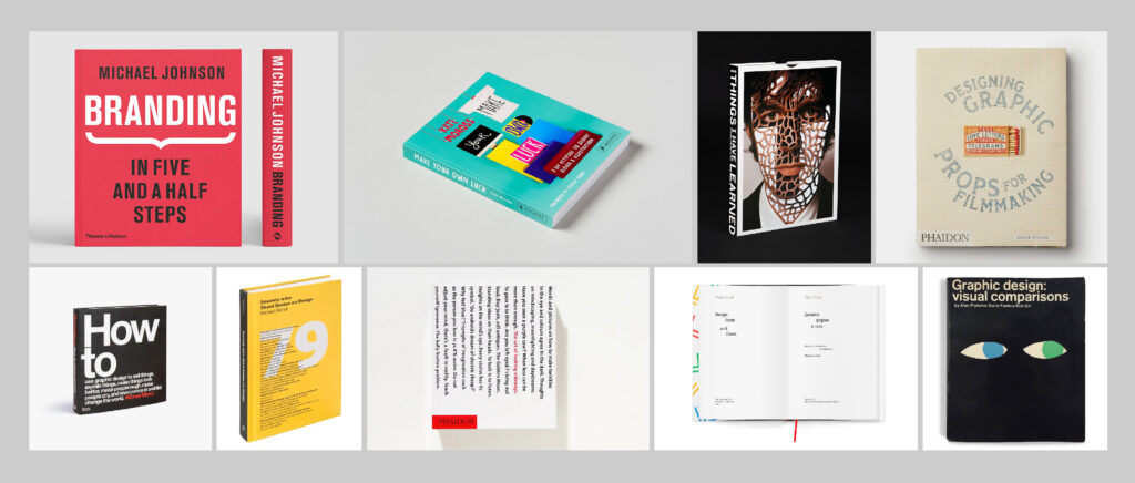
A few designers’ books are referenced as not only useful and well designed, but well written:
— Michael Bierut/How to…
— Michael Bierut/79 Short Essays on Design
— Alan Fletcher/ The Art of Looking Sideways
— Forbes, Fletcher Gill/Visual Comparisons
— Paul Rand/Design, Form and Chaos
What the books on this list have in common is that they were all penned by design heavyweights and hindsight allows us to see they they were destined to be classics, given the enduring legacies of their authors’ work. (1)
Sources (Edited and added to):
(1) Retrieved from: https://eyeondesign.aiga.org/why-do-graphic-designers-write-books
(2) Retrieved from: https://www.eyemagazine.com/feature/article/reputations-neville-brody
(3) Retrieved from: https://www.annieatkins.com
—
Analyse digital and print production techniques used by designers to tell a story.
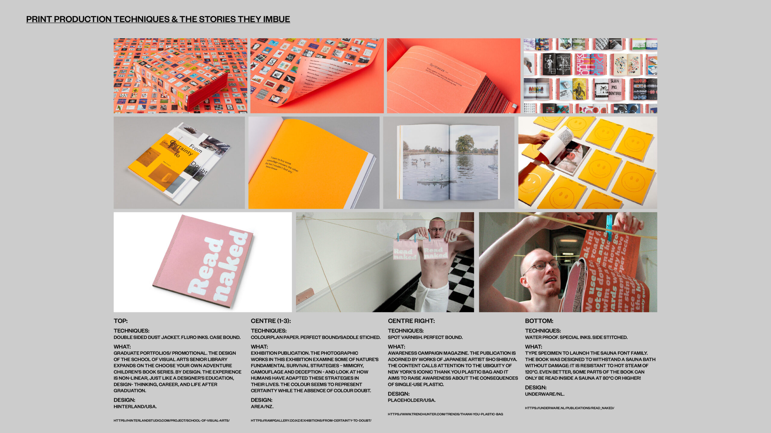
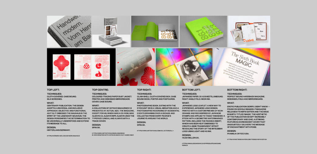
In studying the above examples, some which tell stories better than others, one of the things that stands out is the quality of the production, content and design consideration. The SVA book adds depth and dimension to the publication by creating layers of content and innovative pathways to access the information expressing perfectly the standard of design in the school, its students work and the thought processes that go into the design work produced. For those that have never had a copy of Octavo in their hands, the book reflects the materials and textures of the original publication. This level of detailing cannot be underestimated in the overall representation of the printed piece and add depth and dimension. Maybe, with the launch of the sauna typeface, Underware went too far but in creating a book that you can only fully see the content in a sauna creates another level of experience for the audience. The Bauhaus book is clinical, precise and like a handbook industrial and supports the philosophy of the school and its purpose to design for industrial production. Hugh Millers Japanese Logo Archive takes inspiration from the stamps and papers used for woodblock prints and creates a tactility that is intimately connected to Japan's past and present. All of these additions and techniques whether subtle or blindingly obvious all make for an audience experience that is rich, tactile and support the content within.
—
Deliver a 400-word article, exploring one of the preselected themes, that is presented as a typeset In-Design document, or similar.
CHOSEN THEME: A LOVE LETTER
I Chose this as a vehicle to write a letter to Priti Patel, The Home Secretary as a reaction to the UK Government's stance on letting Ukrainian refugees into the UK.
Copy:
Ma Priti Cheri,
What has made you so embittered. Why so cold, inhuman. Was it the bullying accusations that led you to withdraw from humanity. Is it not time to let down your guard and show us who you really are. I don't believe you believe in what you have to deal with. You have built fences and border controls around your heart, but still we see compassion in your eyes, and lines of worry on your brow. What will it take to pierce through the icy exterior? Why so sad? Can we help? Maybe in your heart of hearts you believe you are doing the right thing; for the queen and for the country. This is not what we want you project to the world. Although we fully understand that the decisions you have to make are not just your own. Can you not see the wave of desperation, tragedy, and misery you leave in your wake? When will you stop to take stock and think about where you want to be, what kind of country you want to live in and what life you want to live. As I look at the home office from afar I see barriers and bureaucracy and you, caught up in a storm that blows from Westminster to Dover.
Meanwhile, in the East we watch on. Powerless voyeurs of a disaster not of ours or your making. Echoes of post-war Berlin ring in the ghost cities, shelters and broken suburbs. You can hear cries in the shifting wind as the march of migration grows ever near. Are you not isolated and starved by your own government? What gains have you made? What happened to the girl whose beating heart was full of songs, of love, happiness, and compassion? Are you able to sleep? It is still not too late for you to come back to us, to cut the ties that bind and find love in the human condition. Open your heart and mind as if you were a door ajar shedding light on a pathway to a new life. Throw the rulebook away and be as free as a bird. Cast your love across the channel. Extend a hand to help those less powerful or fortunate. Come back to us at the stroke of a pen. As I write these words many have died, and many more will follow. Open the door to Europe and to your heart.
With undying affection,
Britannia.
—
Deliver a sketch to outline how you will use digital or print production techniques to elevate the content of your article.
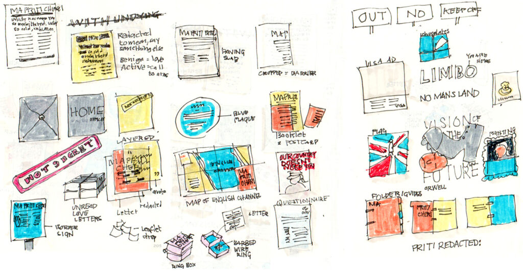
ABOVE: Sketches looking at varying treatments from a conventional letter format, to layered approaches (I.E: tracing paper), folders, maps, signage, packaging and paintings. My favourite treatments are the bottom left blue border sign, above and right the three layers (original letter, redacted letter and Priti quote), above and right the blue plaque and to the right of this the booklet that when the elements are separated becomes indecipherable.
—
FINAL EXECUTION
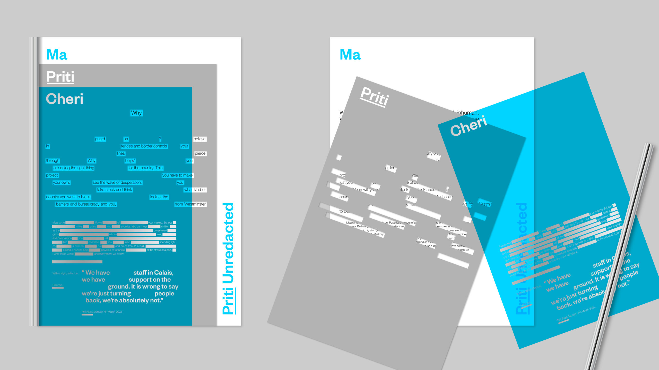
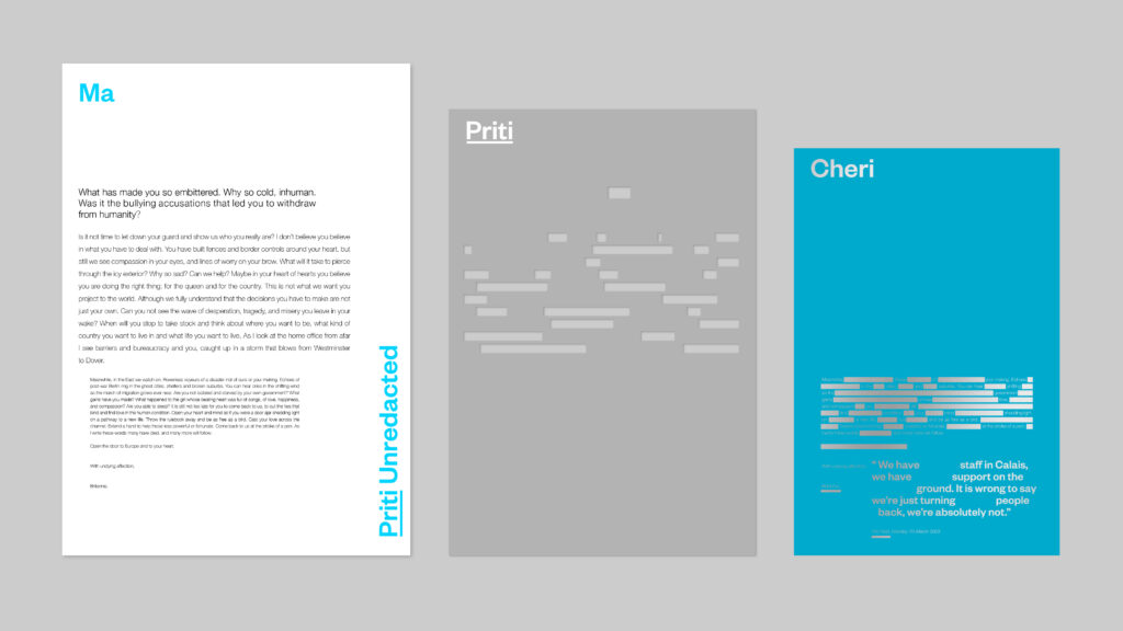
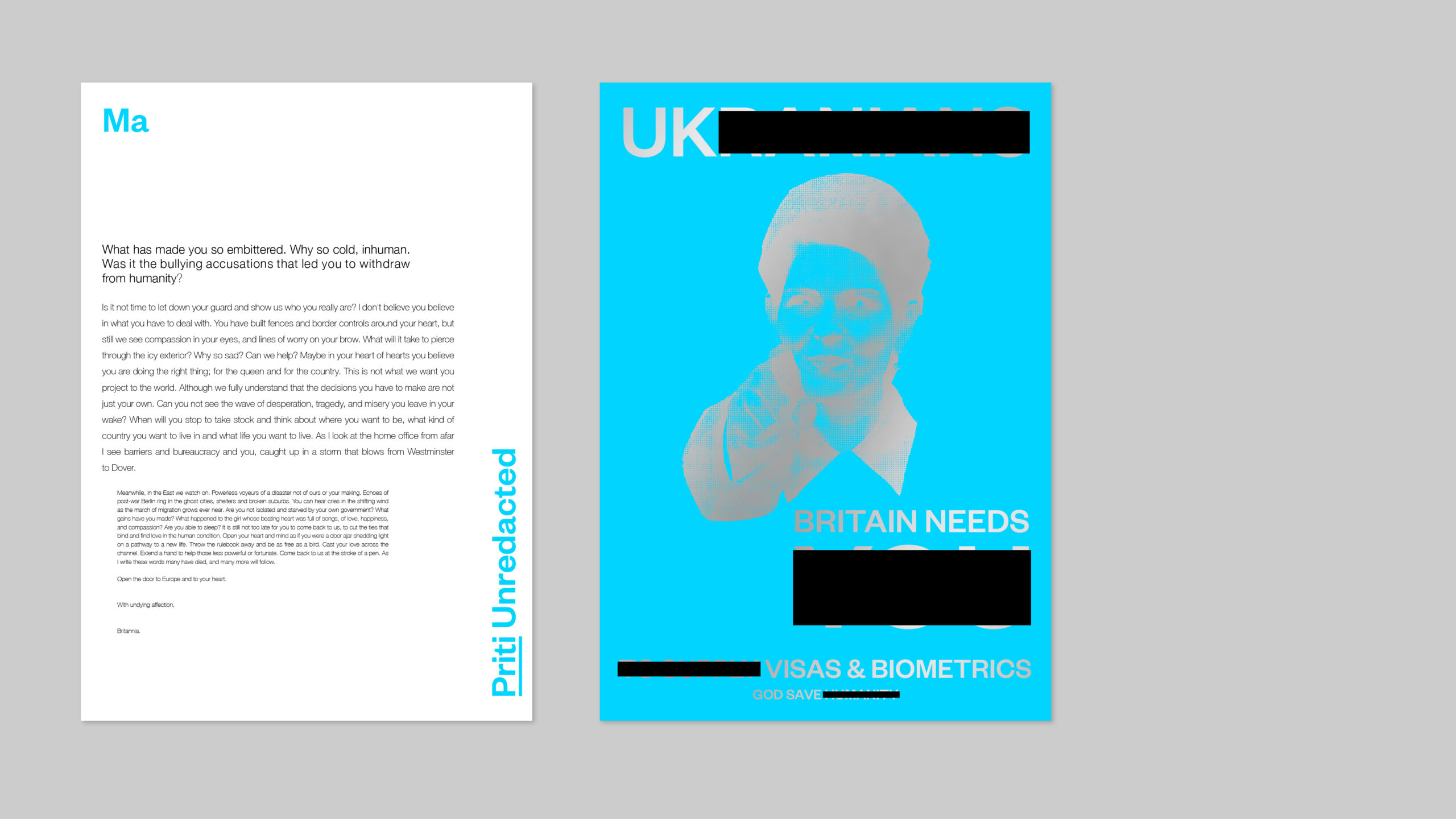
Using the style of government forms I have design a letter which is made up of three key elements. All parts rely on each other when aligned to reveal redacted copy on the initial view with a pro government stance which changes when the unredacted letter is revealed. I propose coloured trace in a blue (Conservative) with silver overprints adding depth, dimension and intrigue to the piece. The letter comes together with a metal silding binder which allows for the constituent parts to also be separated. The letterheads verso doubles up as a poster reflecting the barriers to entry faced by many refugees, in this case Ukranians, gaining entry into the UK.