
Collecting and visualising the unseen
REFLECTION ON LECTURES AND RESOURCES
In Harriets lecture this week she explores the origins of data from pre-history to the present day and the many forms that it has taken. It is an interesting take on data visualisation, especially when she manages to extract information from pre-historic cave paintings combined with a historical understanding of how we perceive the early tribes to have existed through our accepted knowledge of survival, hunting practices and the typologies of animals that existed at the time.
In the article on information visualisation Mesopotamian tablets are also revealed to contain data regarding finance and once the secrets of the hieroglyphs and ideogram's of the Myans were unlocked, new information and data could also be gathered in more modern times. All of these examples clearly illustrate the need of man (woman) to document and record the information that was important to them and it is no surprise that some form of data gathering has been part of human nature since the dawn of mankind.
Over the centuries of 'civilisation' that followed this gathering of information has become crystallised and refined into the forms that we know today. The church were seemingly the first to harness this as a tool of visualisation and control by telling pictorial stories either through the Bayeux tapestry, iconography, painting and the many stained glass windows of their churches.
There have been many examples of data refinement stemming from the 14th century to the present day covering a wide expanse of subjects from tracking the sun to the death toll of Napoleonic armies, and more recently, in David McCandlessess examples, a curious play and pattern discovery that both surprises and delights.
It is interesting that our own use of visual pictography has been born out of a need to systemise information making signage and way finding a universal language. It also fills me with a little pride that systems such as Margaret Calvert and Jock Kinnear's road signs alongside Harry Beck's underground map have had such a global impact in creating this universality. It is this simplicity that has also influenced the way we present complex infographics for the viewer to understand in immediate terms the data they are engaging with.
A combination of methods from William Playfair's bar graphs and pie charts (which are now seen as a basic entry point for data visualisation) to McCandlessess and Monocle's visually striking and fun data captures shows the multitude of approaches your can take to reveal the information contained within. The one thing that seems to unite these approaches is that they they follow Edward Tufte's maxim that you should 'above all, show the data', followed by Linden Leader's view that there should always be 'simplicity' and 'clarity' to the infographic you are creating.
—
TAKE OUTS
— Infographics are a way to visualise complex data simply
— Infographics should be universally understood
— Colour and iconography can aid navigation
— Always show the data in a clear and simplified form
— Data visualisation helps you to discover insight in patterns you would not see normally
— Data, well visualised can peak and engage interest
— Illustrative accompaniments aid understanding, but balance is key
— Data visualisation can also be witty, fun and entrancing
— With backend systems we can now provide live data visualisation as it happens
— Don't overwhelm users with lots of extraneous content
— Simplify and only include the things that matter
— Data is unbiased (based in facts/statistics)
—
Analyse examples of information design to understand the effectiveness of data visualisation.
THE WORLD ECONOMIC FORUM
I recently started following the World Economic Forum on Instagram and get daily videos posted on my feed. The statistics within are particularly interesting because you receive snapshots of problems and some of the positive things that are being carried out to tackle certain issues.
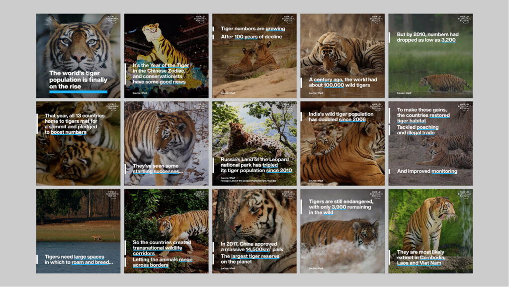
Dig a little deeper into the reports section and you can see the bigger picture of causes and effects that affect the global economy, global health, resources, environment, regional and global politics and migration issues that the world is currently experiencing.
With detailed analysis of data they create infographics within their reports to create a simplified understanding of the complex information contained within. For example in the image below, taken from the Global Risks Report 2022, a snapshot (divider) provides an overview of the 'Barriers to Migration' and within the article we can view more in-depth analysis detailing displaced refugees and the financial loss of developing countries due to migration.
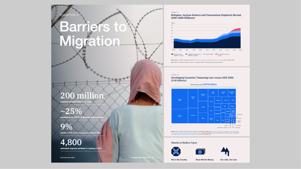
The infographics themselves are very simple in their execution providing easily accessible data through colour, scale and a reduction of the amount of information included which makes the information readily understandable to the viewer. They also employ the use of pictograms to highlight key issues of a particular subject, which in this case are based on prejudice, financial considerations and the readiness of countries to act.
—
Workshop Challenge
Contextualise five examples of information design to analyse their effectiveness at reflecting information about social, political and historical issues.
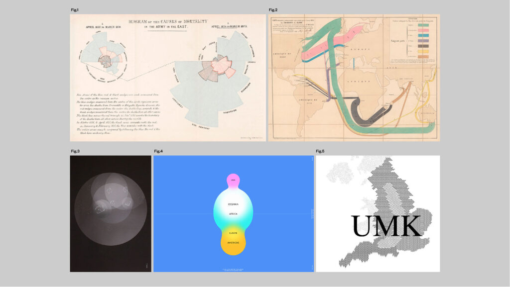
Fig.1: Florence Nightingale, Deaths from Disease (Rose Diagram, 1855)
In studying Florence Nightingales rose diagram you can clearly delineate the rise and fall of deaths between both diagrams with easy to follow colour coded triangles, notation and by following the scale of the triangular wedges themselves. What is harder to see is how the numbers of deaths were applied to the diagram. I am assuming this, but if zero deaths is the centre point of the rosette, then naturally the outer extremities relate to not only the rising deaths but also the number of deaths themselves.
Fig.2: Charles Minard, Global Immigration (1858)
Minard's map of global [migration] indicates the travel and destination of immigrants in 1858. Similarly to Florence Nightingale's rose diagram, Minard's map is relatively easy to follow as the countries of departure and destination are linked with colour coded lines. I am assuming the numbers within the coloured bands refer to the amount of people who left and those who arrived at their destination, accounting for deaths along each route of travel. The decrease in number is the only indication of direction of travel. The only other minor criticism that I would have is that you don't know if the figures are thousands or millions, but I would hazard a guess that in 1858 it would be in the thousands.
Fig.3: Accept & Proceed, Moon Landings (2016)
A+P's process is the perfect example of keeping the information to the bare minimum to create something that is both easily understood and visually striking at the same time. Using data limited to position of landing (longitude and latitude), the name of the mission, and the names of the astronauts or unmanned crafts you can clearly understand the information and it does make for a cool poster with the overlapping circle delineating time.
Fig.4: Accurat and Google News Lab, WorldPOTUS (2016)
This interactive approach to displaying data is both engaging and visually striking at the same time. It's easy to follow the colour coding, key and additional statistical information is shown top left which helps you break down the numbers. The sub-sections on the left provide an added dimension but I am not sure whether the data then refers to where a POTUS stands on a particular area such as Gun Crime or Abortion Law or whether these are just random search statistics that bring up both meta tags. I.E: Hilary + Abortion Law.
Fig.5: Dunn and Raby, UMK: Lives and Landscapes (2014)
Created for a kind of utopian or dystopian view of the future, I imagine Dunn and Raby's data and information will be bourne out of the discussions and experiments that come from the project. I will confess that I don't completely understand it but I can see it's value in starting discussion on wider themes of how society and the environment we live in will be used in the future and there are already some interesting discussions going on on third party sites looking at the viability of the ideas presented within.
—
Write a short synopsis about your research and conclusions in relation to your chosen piece of pre-selected information design.
RESEARCH ON CHOSEN PIECE: FLORENCE NIGHTINGALE'S & THE ROSE DIAGRAM
As a young girl, Florence Nightingale exhibited an interest in and flair for mathematics, encouraged by her father, William. Later on in her study she was profoundly influenced by reading Adolphe Quetelet’s 1835 'Sur L’Homme et le Developpement de ses Facultes´, in which he outlined his conception of statistical method as applied to the life of man (1)
She grew up in a wealthy family, and the family and social expectation was that she would marry and have a family of her own. She, however, had other ideas. She had a "divine calling" as a teenager and wanted to be a nurse, an occupation that didn't really exist at the time. Nurses in those days were typically poor, uneducated, and not skilled in the medical profession as they are today. Her family discouraged her, but she was head strong and from 1851-1853 she trained as a nurse.
During the Crimean War (1854-1856), there were newspaper reports of the terrible conditions in the English war camp hospitals, most notably the Scutari hospital in Turkey (2).
These reports from the war zone soon enraged the British public. The accounts listed high death tolls and descriptions of dying patients crowded on floors of blood soaked straw, with vermin-infested laundry. In short, the field hospitals were killing British soldiers faster than the enemy. Blame was placed on the government and the military.
The Crimean War was fought by Russia against the forces of France, Britain, and the remnants of the Ottoman Empire. It began in October 1853, over disputed claims of the rights of Roman Catholics vs. the Eastern Orthodox Church, and lasted until February 1856.
In October 1854, Nightingale appealed to her friend Sidney Herbert, secretary of state for war, to send her and a team of nurses to the Crimea. Following her persistent requests to the War Office, a Sanitary Commission was formed around April 1855 to investigate the causes of high mortality of the British Army in the Crimea.
On arrival in Scutari, Nightingale was more appalled by what she witnessed than what she had read in the newspapers (1), and while not immediately welcomed by the doctors and other staff, over time, she and her staff were able to make substantial changes to hospital (2). She recognised that most of the deaths occurred, not from battle, but from preventable causes: zymotic diseases (mainly cholera) and insufficient sanitary policy in the hospitals that treated the soldiers (1). She focused heavily on patient care. Cleaning bed sheets, washing patients, writing letters for soldiers, and providing healthier food. The death rate at the hospital declined and she and her nursing staff are often credited for this work (2).
While at Scutari she developed a system to keep meticulous records of the causes of mortality among the British troops. Her initial attempts to understand this data through tables and charts led to shocking comparisons: deaths in the first seven months amounted to an annual 60% mortality from disease alone. This exceeded that of the Great Plague in London (1665-1666) and that of cholera epidemics in 1848 and 1854.
After her return to England in July 1856, Nightingale pressed the government (with some support from Queen Victoria) to establish a Royal Commission to examine the causes of mortality in the army. She submitted a report with many tables and concrete proposals for reform, but little was done. How could she turn her insight from experience and data into a powerful call for action?
She was befriended by William Farr, the chief statistician of the General Register Office established by Parliament to track births and deaths. Farr had become an advocate for the careful use of data toward the goal of improving the health of the nation. Farr and Nightingale worked together to access and organise data from the Crimea, systematically analyse it, and with the help of Farr’s team of clerks, produce persuasive arguments in the form of a series of publications with corresponding text, tables, and diagrams.
Nightingale elevated their collaborative craft to new heights with her infectious motivation to persuade the British government to adopt sweeping reforms to the entire treatment of soldiers. She said, “The main end of Statistics should not be to inform the Government as to how many men have died, but to enable immediate steps to be taken to prevent the extension of disease and mortality" (1).
She was clearly a pioneer, not only in the area of nursing, but also in statistical analysis, and more specifically, in the presentation of the data (2).
—
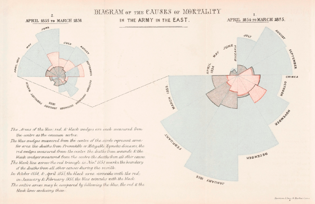
Nightingale’s most celebrated diagram was just one of several attempts by her and others to portray the deaths among British soldiers in the Crimea in a way that would capture attention of her readers and provide motivation for a call to action. To understand her graphic design, one key rhetorical question that permeates this work is “compared to what?”.
She broke new ground here in several interesting ways. Initially, she had just total mortality data, month by month in selected field hospitals of the East. But, how could she make these results most dramatic? She employed what we would now classify as a “radial, polar area chart”. Unlike a pie chart, which uses sectors of varying angle and equal radius to show amounts, her diagram uses wedges of equal angle (for the months) and varying radius to portray deaths. Nightingale had no particular name for this chart form, but it is common and acceptable to call them “rose diagrams”. Perhaps the most striking feature of her design of this diagram was the separation of the months into two charts, one (on the right) for the period April 1854-March 1855 and the other for April 1855-March 1856. She could have placed the data for all 24 months in one chart, but her design makes a direct comparison of the deaths before the arrival of the Sanitary Commission with those after. Just a pre-attentive, millisecond glance shows the great difference in size (deaths) between the two portions (1).
“The purpose of [data] display is comparison (recognition of phenomena), not numbers.”
J. W. TUKEY (1).
—
She had seen a polar diagram in William Farr’s 1852 report on potential causes of mortality due to cholera and was much impressed. In this he drew circular diagrams showing weekly temperature and cholera deaths in London over the period 1840-1849, as if to establish some link between the two. This kind of chart is sometimes called a radar chart today. Farr was searching for easily found associations with cholera mortality. No direct link to temperature or other factors that he tried (e.g., elevation above the Thames) could be found, until John Snow (1855) argued for a water-born causative agent. Nightingale was impressed enough with Farr’s use of a radial diagram to adopt this form for her own data.
In 1858, she followed Farr’s design, which plotted deaths on a linear scale (of deaths per 1000) as distances from the origin, with radial axes corresponding to 100, 200, 300, etc,. What she saw here was beyond astounding. The deaths from preventable causes (zymotic diseases) totally swamped those from battle wounds or other causes, and totally dominated the scale. In her diagram she shows the annual rate of mortality in the sick population of Scutari, where the fraction reached 415% in February by her calculations. She quickly realised that although the data was correct, the graph was deceptive, because the eye tends to perceive the area rather than length in such displays: doubling the death rate would give a perceived area four times as large. In her subsequent versions, Nightingale plotted deaths in each month as the square roots of distance from the center, so the area of each wedge reflected the number of deaths. It is easily seen that deaths from preventable diseases (the outer blue wedges) totally dominate those from battlefield wounds and other causes. This was yet another aspect of her graphical insight that “compared to what” meant that meaningful comparisons had to be on a reasonable scale (1).
—
While Nightingale is often credited as the inventor of such charts, it is useful to consider earlier origins.
The earliest direct precursor of Nightingale’s rose diagram appeared in an 1829 publication by André-Michel Guerry. His goal here was to try to determine if relationships among meteorological variation and physiological phenomena could be found by graphical means; but particularly to show how these could be represented as cyclical phenomena, over months of the year, hours of the day, days of the week and so forth. He established the idea that diagrams of cyclical phenomena can reveal consistencies not easily seen in tables. Graphical methods were still on the rise in 1829.
The link from Farr to Nightingale is clear, but the question arises whether Farr had gotten inspiration for radial diagrams from Guerry. In the early 1800s, following the societal chaos after Napoleon’s 1815 defeat, a new idea of “social medicine” or “social epidemiology” began in France. In 1829, the leading proponents launched a new journal, Les Annales d’Hygiene Publique et de Medecine Legale, and Guerry published his study in their first volume. It is known that Farr received a bequest in 1828, studied medicine in France and Switzerland, and most likely struck up a friendship with Guerry through the network of the Annales d’Hygiene Publique. In 1883, Guerry published his Essai sur La Statistique Morale de la France. In this, Guerry argued that the relations among social and moral variables (literacy, crime rates, suicide, etc.) could be understood using graphs and shaded (choropleth) maps. More importantly he asserted that lawful relations among moral variables could be found, analogous to those of physics. Within a short period of time, this work attracted considerable attention in European statistical circles and Farr was among his admirers.
Over a period of 30 years, Guerry displayed his maps and charts in several expositions in Europe. In 1851, he had two exhibitions – an honored public one in the Crystal Palace at the London Exhibition and a second one at the British Association for the Advancement of Science (BAAS) in Bath. The Statistique Morale de l’Angleterre and its splendid plates were put on public display for the nearly 2800 members who attended, and became the subject of a public commentary by W. Heywood, vice-president of the Society. Farr was not a graphic innovator, but he was tuned-in enough to recognize useful graphical methods and apply them in his work. It is quite likely that his radial diagrams were inspired by Guerry, and perhaps those of L´eon Lalanne (1).
—
The history of Florence Nightingale and her radial diagrams has many stems and buds. These charts at the time were so novel for her audience that they demanded attention to her essential point: mortality in the army could be decimated by simple medical hygiene measures. But they also seem to demand an equally iconic name. Nomenclature is one stem with multiple buds: “rose”, “coxcomb”, “wedge” diagram are all terms used to refer to these. None of these names have evidence in her writing that she called it as such (1), but in the "rose" diagram she had designed one of the most famous data visualizations ever created (2).
…
Sources (truncated and edited):
1 (Retrieved from: https://www.datavis.ca/papers/Nightingale-radiant.pdf).
2 (Retrieved from: https://www.dataplusscience.com/NightingaleRedesign.html).
—
500 WORD SYNOPSIS
While Florence Nightingale is widely known as ‘the lady with the lamp’, a nurse during the Crimean War (1853-1856), she is less known as a statistician.
Introduction
On reading news reports of the war describing the appalling conditions of hospitals in Scutari, Turkey; Florence appealed to the secretary of state to send her and her staff to the Crimea. Through her persistence, a Sanitary Commission was formed in 1855 placing them at the epicentre of the war.
Once in Scutari she discovered conditions were far worse than described. Initially meeting resistance from the hospital treating the soldiers, they were eventually allowed to start implementing vital changes focussing on patient care: sanitation, cleanliness and healthier eating.
She soon discovered an alarming pattern; finding the majority of deaths were caused by disease and unsanitary conditions. As a direct result of their work, the death rate slowly started to decline.
Significantly, she had the foresight to systematically keep records detailing the causes of the deaths among troops. After seven months of data gathering she found 60% of soldiers had died from disease alone, exceeding previous epidemic figures.
On her return to England she pressed the government to establish a Royal Commission to look into deaths of soldiers from the Crimean war, to no avail.
The power of persuasion
She befriended William Farr, chief statistician of the G.R.O. and they worked together accessing, analyzing and organizing data from the Crimea. The goal: to produce a document supporting reforms for the treatment of soldiers applying persuasive data and facts.
Adopting a polar diagram created by Farr, Florence initially created a periodical diagram based on mortality in East Crimea. She developed this, applying equal wedges for months and varying radial depths for deaths which emanated from a central point. Nightingale’s genius was to place the diagrams side by side. One depicted April 1854 - March 1855, the other April 1855 - March 1856. This attention to the graphic detailing demonstrated the effectiveness of the Sanitary Commission before and after they arrived. In 1858 ‘Notes on Matters Affecting the Health, Efficiency, and Hospital Administration of the British Army’ was published containing her graphic: "Diagram of the Causes of Mortality in the Army of the East”, which is known as the “rose” diagram.
Analysis of the design
In today’s terms, the “rose” diagram appears simplistic. However, it is precisely this simplicity and clarity that led to reforms in conditions for Victorian soldiers. Her ability to filter extraneous details and focus only on the impact of scale, period, numbers and place is remarkable. The simple colour application and descriptive ‘key’ also provides clarity and in placing the diagrams side by side you can clearly see the patterns she was aiming to reveal and shock with. If I have one criticism of this design it is that we don’t see the actual numbers or percentage radials that equal the deaths. But this is a moot point as this is not what she aimed to achieve. Its simplicity was the key to its success.
—
Develop, design and make a piece of editorial design utilising relevant tools, skills and technologies to reflect your writing and visual research.
INITIAL SKETCHES
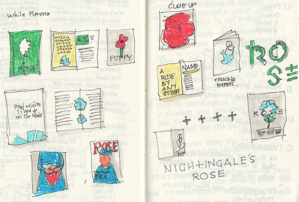
I explored a few different approaches: Turning the 'Rose' Diagram into an actual rose, an idea of the old style of design versus the new, breaking the diagram down into pure colour segments, using drama (blood soaked nurse holding rose), turning the article into a magazine format to make it more current, using tracing paper to layer and break down the diagram, and creating a simple one-sided poster.
I have developed my concept, amalgamating a few of these different themes for my final execution. I have kept the approach quite absrtact as the information is kept within the synopsis and if the viewer want to explore more they can dig deeper and go on their own path of discovery.
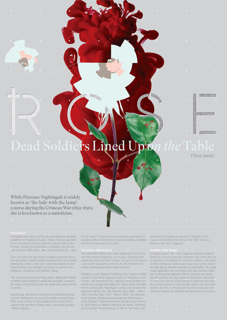
I thought about materials and that this would be nice to have some layers like textured aper stock and foil blocked type.