Reforming and projecting a new future in a type design
—
REFLECTIONS ON LECTURE AND LAST WEEKS TASK
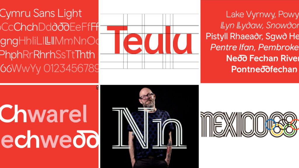
The Colophon project is really interesting and prescient for me as there are striking parallels with my own project. Both the understanding and undertaking of designing not just for a place (in Colophon's case Wales/Cmyru), but in the uniqueness brought about by that place through it's ancient but alive vernacular language (Gaelic). As part of my own research into Dublin and the history of their native Gaelic I found that Scots Gaelic was passed over for it's own typeface and that they inherited a latin Gaelic style commissioned by Elizabeth I to control the masses through language and protestantism.
The English and Irish have had a troubled past and this made me ask myself if I even have the right to approach designing Gaelic language typography for an Irish audience. However, I would not be the first (the British Elizabethan's produced the first moveable Gaelic font for Ireland) or the last outsider to approach this problem.
I asked my son what he thought…
"You've already had the six counties. Leave our typography alone"
LIAM TRUMBLE
—
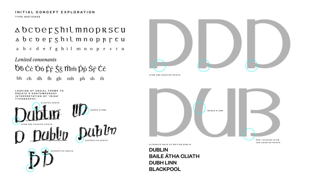
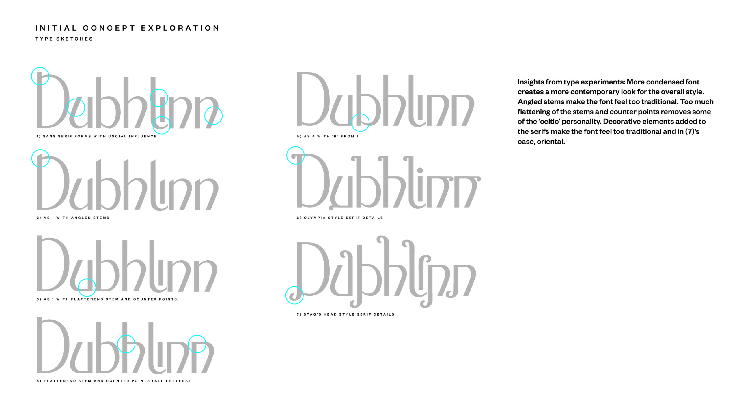
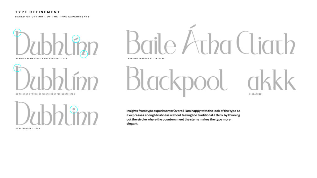
He also made an interesting point that you could frame your approach from your own perspective. A more personalised typographic take on the country you are living in. Looking at the work produced by Colophon for a Welsh language font you can see that the hand of the type designer, his or her nationality has no bearing on what is an extremely considered and sympathetic design. I think I can approach this task with a similar degree of sympathy to the forms and will seek some Irish language speaker's input into the design to ensure it reads and appears as it should, meeting the criteria of the given vernacular. As part of this I will need to research the specific glyphs that appear in the word 'Dublin' and choose either to take the path of using pure Gaelic, or a combination of Gaelic and latin for the type experiments. As the Fianna Fail government phased pure Gaelic typography out in 1965 it makes more sense that it would be a mix of both for the modern Irish native to be able to read it clearly.
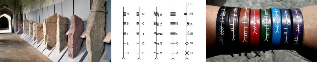
I would also like to extend my research further back than Gaelic itself as the Irish used a pictorial language between 4th and 9th centuries called Ogham (pronounced 'ome') which I think will give additional elements to the typography that are not typically 'Celtic' or clichéd.
I would also like to briefly compile a visual audit to get an idea of the current landscape that exists in the writing of the word 'Dublin'.
—
REFLECTIONS ON SOURCE MATERIAL
Lance Wyman explored similar referential touch points to Colophon in the creation of his typographic design for the Mexico Olympics in 1968: Historical Archive, (Pre-Columbian) Art Reference and Typographic Reference; and he also had to find a way to overcome the trilingual vernacular languages of the country he was designing for. He cleverly overcame this language issue by creating a non language based symbol set. I think this works brilliantly well in the context of the olympics and is the perfect solution for a signage system.
The radiating circles logotype reflecting history and place is still a great piece of individual branding design and the overarching colour scheme, and look and feel works really well. It still feels contemporary by todays standards. Personally I feel the same attention to detail given to the logotype did not filter down to icon sets with varying illustration and symbol styles used. Having said this the approach taken in 1968 is still fairly radical, especially when you consider the work is as old as me and looks like it was made yesterday…
It would be pretty amazing to see someone like Studio Dunbar turn the Mexico logo into a variable type animation.
—
TAKE OUTS
— Keep your research and sources broad.
— Don't use historical reference points if they create barriers to readability or contemporary vernacular.
— Ensure the readability for the vernacular you are designing for.
— Look for established visual cues but not clichés..
— Partner with native speakers (Not necessarily designers).
— Research how the type will be seen, used and by who. What and who is it for?
— Ensure flexibility is built in for the user (Glyph's, Character Sets, Variable/Scalable).
— Find ways to reduce waste within your design (Ink Coverage).
—
A POTTED HISTORY OF OGHAM
Ogham is an Early Medieval alphabet used primarily to write the early Irish language (orthodox inscriptions, 4th to 6th centuries CE), and later Old Irish (scholastic ogham, 6th to 9th centuries). However, A period of writing on perishable material prior to the preserved stone monumental inscriptions needs to be assumed.
There are roughly 400 surviving orthodox inscriptions on stone monuments throughout Ireland and western Britain. The largest number outside Ireland are in Pembrokeshire, Wales.
The vast majority of the inscriptions consist of personal names. According to the High Medieval Bríatharogam, names of various trees can be ascribed to individual letters. For this reason, ogam is sometimes known as the Celtic tree alphabet.
The etymology of the word ogam or ogham remains unclear. One possible origin is from the Irish og-úaim 'point-seam', referring to the seam made by the point of a sharp weapon.
It appears ogham alphabet was modelled on another script, and some consider it a mere cipher of its template script (Düwel 1968: points out similarity with ciphers of Germanic runes). The Latin alphabet is the primary contender mainly because its influence at the required period (4th century) is most easily established.
In Ireland and in Wales, the language of the monumental stone inscriptions is termed Primitive Irish. The transition to Old Irish, the language of the earliest sources in the Latin alphabet, takes place in about the 6th century.
THEORIES OF ORIGIN
There are two main schools of thought among scholars as to the motivation for the creation of ogham.
Carney and MacNeill suggested that ogham was first created as a cryptic alphabet, designed by the Irish so as not to be understood by those with a knowledge of the Latin alphabet. In this school of thought, it is asserted that "the alphabet was created by Irish scholars or druids for political, military or religious reasons to provide a secret means of communication in opposition to the authorities of Roman Britain. The desire to keep communications secret from Romans or Romanised Britons would have provided an incentive. With bilingual ogham and Latin inscriptions in Wales, however, one would suppose that the ogham could easily be decoded by at least an educated few in the Post-Roman world.[22]
The second main school of thought, put forward by McManus, is that ogham was invented by the first Christian communities in early Ireland, out of a desire to have a unique alphabet for writing short messages and inscriptions in the Irish language. The argument is that the sounds of Primitive Irish were regarded as difficult to transcribe into the Latin alphabet, so the invention of a separate alphabet was deemed appropriate.
A theory popular among modern scholars is that the forms of the letters derive from the various numerical tally-mark systems in existence at the time. This theory was first suggested Rudolf Thurneysen and Joseph Vendryes, who proposed that the ogham script was inspired by a pre-existing system of counting based around the numbers five and twenty, which was then adapted to an alphabet form by the first ogamists.
(Retrieved from: https://en.wikipedia.org/wiki/Ogham).
—
FORMING THE IDENTITY OF DUBLIN YESTERDAY AND TODAY
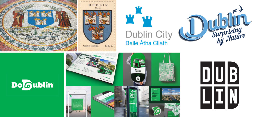
LEFT TO RIGHT: (Top) Dublin City Hall floor mosaic (19th C.) with the cities coat of arm's, 3 castles shield, Dublin City Council identity, Annie Atkins identity for the Irish Tourist Board 2015, (Bottom) Richards Dee's Identity for Dublin Bus's original sightseeing tour 2017 and Designworks digital identity for Dublin.ie.
In breaking down the elements that make up an external view of Ireland without going into Irish Clichés or stereotypes (Tricolours, Shamrocks, Harps, Leprechauns, Overtly Celtic etc..); Green is the colour that best represents both the National Identity and the island of Ireland (green pastures).
For Dublin City itself there are two blues: Those used for the county flag and Gaelic football team. These colours take their heritage from the city's coat of arms. The three castles (or Viking gates into the city) are also identifiers of Dublin and are widely adopted, although the flames coming out of the turrets depicting a burning city are not transferred into modern interpretations of the design.
Annie Atkin's Identity for Failte Ireland (Irish Tourist Board) was the first identity to step aside from associated Irish cliches, although the original drawing of the letter 'D' came from Celtic forms. The goal for this was to present Dublin as a holiday destination that sat "between the mountains and the sea". (Retrieved from http://www.logo-designer.co/annie-atkins-designs-logo-for-dublin). Richards Dee's design for Dublin Buses original sightseeing tour was created to cut through the visual clutter in the city. It is successful in its goal to achieve maximum visibility but the idea that the spiral in the 'D' is a pathway and 'eye' is pure post rationalisation. They would've have been better off saying it had Celtic undertones with a modern twist and left it at that. Designworks identity for Dublin.ie leaves any Irish visual cues behind and is largely successful for its simplicity and online portrayal of a modern Irish city.
—
TAKE OUTS
— Blues and Green = Dublin and Ireland
— Heritage elements can be used but with a modern twist.
— Think about the 'Dublin' you want to portray - Modern, Thriving, Forward Looking…
— Try to avoid falling into applying or reinforcing stereotypes or clichés.
—
Workshop Challenge:
Use the DNA of your initial visual research from Week 1 to create a new and unique piece of typography that spells out the name of your town or city. Your new title lettering should reflect the identity of your town or city. Consider the interplay between provenance and historical story, in contrast to more strategic alignment to a design’s positioning.
Define and analyse your research into local typographic language and experiment with new and original letterforms. Develop, design and make new and original letterforms, which create a new and unique title typeface that spells out the name of your town or city.