History revealed — Interpreting typographic vernacular (globalisation)
REFLECTIONS ON LECTURES AND SOURCE MATERIAL
—
LECTURE
It was interesting to see the PBS type film where experts in the industry discuss what typography means to them and how they unlock simplicity to solve complex problems whether using colour and form to help you to internalise an identity, the textural aspects and tension of typography in its use for dynamic outcomes, or to simply and clearly convey detail and a message with a unique form.
Paula Scher looked at ways to evoke a response with the desire of hopefully sharing something new. It was interesting in the way she broke down the design of her work for the Public Theatre into three parts making the type talk (message), typographic (Consistency) and rap (Expression). This was a very simple but clear insight into how she approached a particular problem whilst maintaining a coherent typographic look.
Vaska and Petraza take the scientific data and distill it down to create expressive, fun and simple infographics that engage and make information easy to digest in bite sized chunks, while Hoefler Frere Jones look for a nuanced style or cut for their fonts to create uniqueness without compromising on legibility. Eddie Opera melds all of these things together using materials and sculptural design to influence his typographic expression.
…
A POTTED HISTORY OF TYPE
Stuart's lecture covered key changes in both the world of print and typographic invention from Gutenburg to the present day. One key thing for me that runs through all of these developments is the change in production techniques and technological advancement. Matt Cohen's assertion that a a certain point we went from the production of products to their promotion underlines the birth of advertising which also dramatically changed in the post war years with the invention of television and radio.
I found the short film on New Johnston particularly interesting and was actually surprised that the team didn't know why the quirky 'tilders' had come into being. As Johnston's background was calligraphy the 'tilder' design was actually based on the pen stroke, which when developed into the humanist Johnston, gave it its uniqueness. It was also interesting to revisit the story of the underground once more where Frank Pick battled to simplify outmoded signage systems and tackle the problem of Victorian advertising that was confusing plastered all over the stations. It actually made me think of where we are now with somewhere like Times Square and that we have almost gone full circle. From considered systematic clarity back to complete chaos and over saturation, and that this bombardment of design and information is prevalent, not just in the external world of advertising but also in our daily online lives.
It was also interesting to read the interview with Massimo Vignelli where he asserts that he made a mistake in the design of the New York subway map by using geography to determine the placement of the stations, something that Beck has resolved not to do with the underground map back in 1933. This only became a problem as subsequent stations were added to the design, the current one more confused than Unimark's original solution. Although, Unimark developed a system with more that was good in its inherent simplicity and the design still stands up today for its clarity of design. It's amazing to think both the London Underground and the New York Subway systems were design in the 30's and 60's respectively as they still feel very current today. Maybe the simplicity and clarity of their design is the key to the success and longevity.
—
TAKE OUTS
— Simplicity of colour, form and information helps you internalise a visual identity.
— Typography is used to evoke a response, be persuasive and show something new.
— Texture, form and visual dynamics help to create tension.
— Too much text = not enough tension or dynamics.
— Simplicity is achieved with the least amount of variation in font size and style.
—
Workshop Challenge
Photograph a broad selection of typography and lettering examples (minimum 10) that illustrate what you believe define the identity of your hometown, nearest city or surrounding area. We want you to research and collect a broad range of examples taken from historical and contemporary reference points.
SAFARI TYPO
This project reminds me of the work conducted by Amsterdam's Underware Foundry and Thomas Sipp's subsequent film 'Safari Typo Amsterdam' where they explore the city through its unique typographic and architectural reference points.
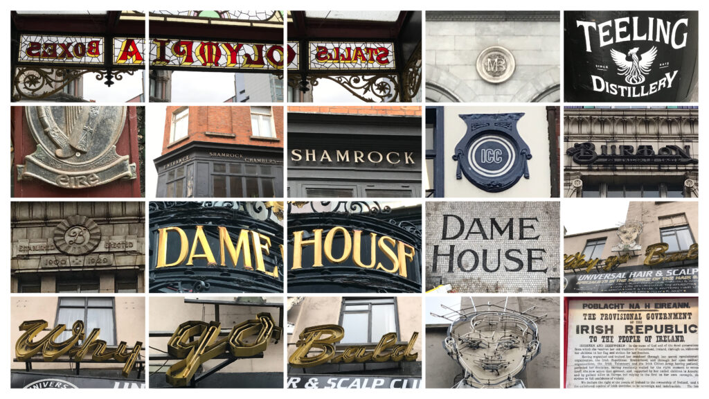
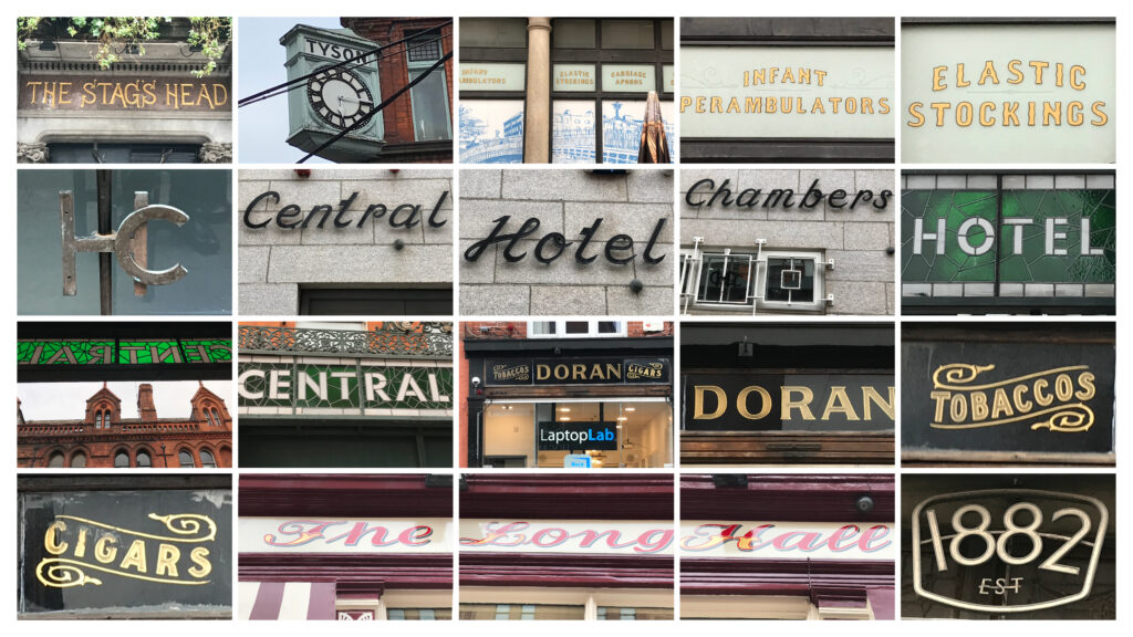
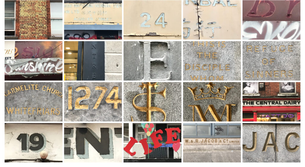
SAFARI TYPO DUBLIN (25/01/22)
My own typographic derive round Dublin.

—
Your collection should be edited down to five examples you think best reflect the identity of your location.
My Five Examples: The Olympia Theatre, 'Why go Bald' signage, The Stag's Head public house, The Carmelite Church and typical dual language Irish street signage.
There are many more interesting examples of typography from my derive but if I am to define a sense of place that Irish people recognise as Dublin and others as 'Irish' then these are the best examples. I was particularly interested in this idea of how globalisation had affected the landscape and examples where the business has gone but the signage remains such as those seen in the Doran's, Central Dairy and Jacobs examples, but if I am truthful to the brief these typographic expressions could be found in any given city in the world being either as turn of the century (1899-1900) or 1930's examples.

—
Discover and analyse a selection of typefaces you think appraise the social, political and historical context of your location.
We can't start the discussion about Irish type design before first addressing the dual language of the Nation and the Irish or 'Gaelic' alphabet.
According to S. H. Steinberg, (Five Hundred Years of Printing, Harmondsworth: Penguin Books, 1955, 179.), the quirky Irish Gaelic alphabet represents nothing more than a curious bypath of Western typography and should be scrapped: “Irish literature (and Irish tourism) would probably be better off without the encumbrance of a script which, though most decorative on postage stamps, raises an additional bar to its understanding”.
The script in question evolved in the Irish scriptoria of the fifth century, with eighteen letters and diacritical marks. Far from having been developed in Ireland, Irish scriptoria typefaces were first designed and cut in England. The creation of these fonts was originally a by-product of Elizabethan church policy. They later became a weapon of the Counter Reformation and later on of Irish nationalism.

ORIGINS
For the Elizabethans, Ireland was an 'exotic' place with a frustratingly different language. Some of the Queen’s representatives in Ireland called for either education or ethnic cleansing as a solution to the general problem of communication and it was argued that changing the vernacular language would facilitate widespread religious instruction. The Queen was personally involved in a far less aggressive project, using the Irish language to spread the message of the reformed church. In the 1560s she commissioned a manuscript Irish-Latin-English Primer from Christopher Nugent to help her communicate more efficiently with her Irish subjects.
"As speech is the means whereby subjects learn obedience, and their Governors, understand their griefs and harms; so the same delivered by an interpreter, can never carry that grace, or proper intelligence, which the tongue itself being understood expresseth".
CHRISTOPHER NUGENT / (C. Nugent, The Queen Elizabeth Primer of the Irish Language, Facsimile reproduction, Dublin, 1988,)
—
Nugent’s interpretation of contemporary manuscript Irish letters became the official blueprint for a future Irish Gaelic printing project. The stimulus for this project came in 1567 from an unexpected source, a Gaelic translation of John Knox’s Book of Common Order. (John Knox, Foirm na Nurrnuidheadh [John Carswell translation], Edinburgh, 1567, 26). The text was written in classical Gaelic which was comprehensible to both Scottish and Irish groups. It was printed using a Roman typeface, a practice which would become the norm for Scots Gaelic in the future. Elizabeth hoped that the Irish would accept the books and that Protestantism would be allowed to slip in like the Greeks inside the Trojan horse.
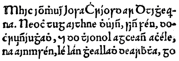
Anxious about this perceived expansion into Ireland of Knox’s project, the established Church responded with the printing in 1571 of John Kearney’s 'Aibidil Gaoidheilgh agus Caiticiosma' (Gaelic Alphabet and Catechism) using exclusively Irish letterforms. Kearney, the Cambridge educated clerk and treasurer of St Patrick’s Cathedral in Dublin was commissioned to produce a vernacular religious text par excellence. This book was not only written in the language of the place, but it was also printed using letterforms based on the Irish minuscule manuscript. In his preface, Kearney reinforces the connection between typeface and religion:
"Here you have… the true and perfect type of the Gaelic language which will open to you that road which leads you to knowledge and which has been closed to you formerly".
JOHN KEARNEY / (John Kearney, Aibidil Gaoidheilgh agus Caiticiosma, Dublin: John Usher, 1571, preface [no page num (…))
—
To the modern observer, the Queen Elizabeth typeface looks very tidy on the page. The letters are upright, well-proportioned and well-spaced. The traditional letterforms seem to have been respected. Unfortunately, this was not at all how it was perceived by contemporary observers to whom it represented too great a leap from manuscript styles and contained too many Roman letters. Kearney also anticipated criticism of his typeface because he asked his readers…
"Not to revile or insult or disparage it, but wherever you find a fault or blemish in it to do your utmost to correct and improve it."
JOHN KEARNEY / (Dermot McGuinne, Irish Type Design, a History of Printing Types in the Irish Character, Dublin: Ir (…))
—
The Franciscans in exile in the Irish College at Louvain in Belgium, accepted both Elizabeth’s gift of Irish Gaelic typography and Kearney’s invitation to perfect it. From their own scriptorium emerged the design for a new typeface, based on the handwriting of the guardian of the college, Bonaventure O’Hussey.
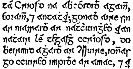
Not only was this catechism written in the vernacular, both in language and letterform, the typeface had the added value of being designed by Irishmen. As the ideological struggle continued, more Catholic Gaelic typefaces were cut in Paris and Rome to answer the Protestant challenge and this typographic tit-for-tat between centres of Catholic and Protestant propaganda production continued for over 100 years.
NATIONAL LETTERS
The second key moment in Irish typographical history occurs in the 1830s with the coming together of George Petrie, John O’Donavan and Eugene O’Curry in the Placenames and Antiquities section of the Irish Ordnance Survey. In the hands of these passionate researchers, the survey became an act of cultural recovery paving the way for 20th century nationalism with an enormous body of documentation on Irish topography, social history, antiquities, genealogy and the Irish language. It was Petrie himself who designed the typeface. Historian Dermot McGuinne assures us that:
As a keen student of early Irish manuscripts and one who had devoted much time to the study of Irish stone and metal inscriptions, [Petrie] was well suited to the task of type design. [he] would have been conscious of the qualities of a type that contribute to its readability and effectiveness. Petrie’s research for appropriate letterforms led him back to the classics of manuscript lettering. An advertisement for the Annals of the Four Masters explains “Some of them [the letterforms] date as early as the 6th century”. (McGuinne, Dermot, Op.Cit., 99.)
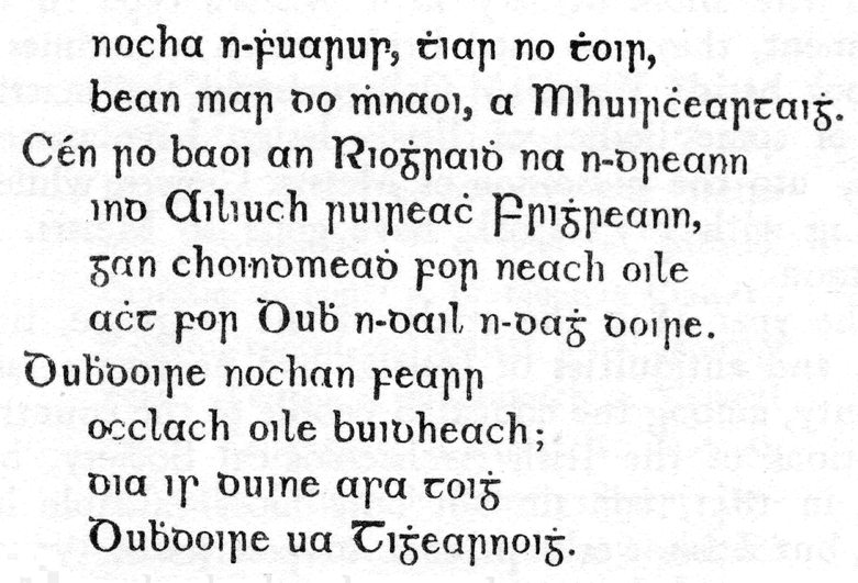
If it hadn’t been designed by Petrie this typeface probably would have generated more criticism than the Queen Elizabeth design. Suddenly, readers had to familiarise themselves with radically different word shapes. This was the first time the semi-uncial style found in The Book of Kells had been used in Irish printing, and the 250 years since Elizabeth’s typeface hadn’t prepared anyone for this development. Furthermore, there was no reason to depend so heavily on manuscript letterforms so far into the development of Irish language printing. In spite of McGuinne’s confidence in Petrie’s design abilities, the finished product had more to do with the designer’s personal preference than with technical or historical considerations. Unfortunately, certain letters are easily confused with others. The typeface certainly looks Irish and suggests antiquity but clashes with contemporary handwriting and typographic styles.
This was not Petrie’s last say on the matter, however. All books printed using this typeface and its derivations were published by the Dublin University Press at Trinity College. When a Catholic university was set up in 1854, access to these Protestant types was denied. John Henry Newman, Rector of the new university, had to choose between outsourcing his Irish printing to the college printing office of a Protestant university or casting a new font for the Catholic university’s own use. He chose the latter option and it was again Petrie who designed the new font. This time he had a new brief: the Catholic typeface was to be based on the Irish minuscule and not on the semi-uncial form. The Catholic university’s Gaelic texts could therefore be easily distinguished from their Protestant counterparts and, even though the same man had designed both, it was argued that the Catholic version was the more authentic.
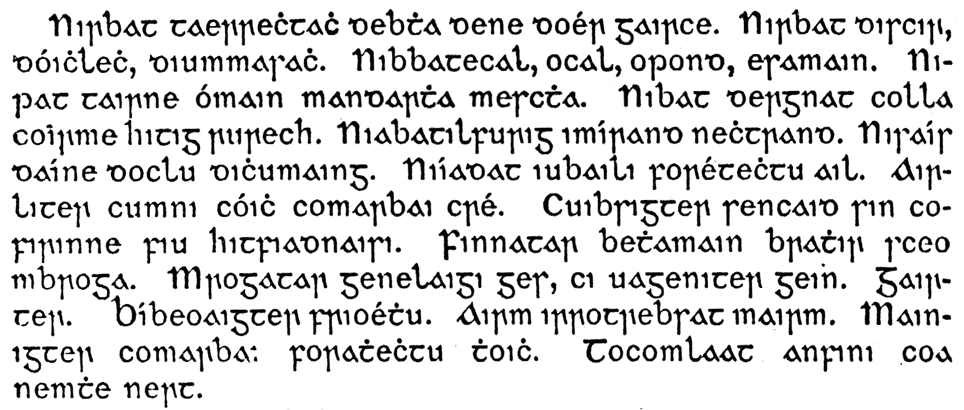
The Newman typeface is a better compromise between contemporary typographic culture and historical authenticity. The minuscule script, with its triangular A and overall spiky look had always been preferred for the writing of Irish Gaelic. Compared to the Semi-Uncial, which was a painstakingly slow script used for the transcription of Latin religious texts, the minuscule script was quicker and more practical. This typeface proved to be so readable that the standard typefaces for the next 100 years were modelled on it.
The promotion of Irish Gaelic typefaces laid the foundations for 20th century nationalists who used the language and the letterforms to justify their claims for independence. Newspapers were the main source of propaganda at this time and it can be argued that as the Century turned, Irish nationalism was very much a conspiracy of printers. These nationalist printers, however, were hard-pressed to find the necessary typefaces to print the Irish language in all of its vernacular glory. Irish nationalists, led by Bernard Doyle, proprietor of the Franklin Printing Works in Dublin, approached the British type-foundry of James Figgins. With the acceleration of Irish language printing in the early 20th century, the American Linotype and Monotype companies both produced typefaces based on the Figgins model, and these were still in use when the typographic reform of the early 1960s made them redundant.
RECENT TIMES
Between 1961 and 1965, the use of Gaelic typefaces for the printing of texts in the Irish language was phased out by the Fianna Faíl government. The main architect of this process was the minister for Education Patrick Hillery and a timetable was established by his department to allow children who had already been exposed to Gaelic letterforms to continue to use them until the end of their primary education. One reason for this reform was that the role of typography in identity politics had come to an end. The distinctive look of written Irish had lost its propaganda value.
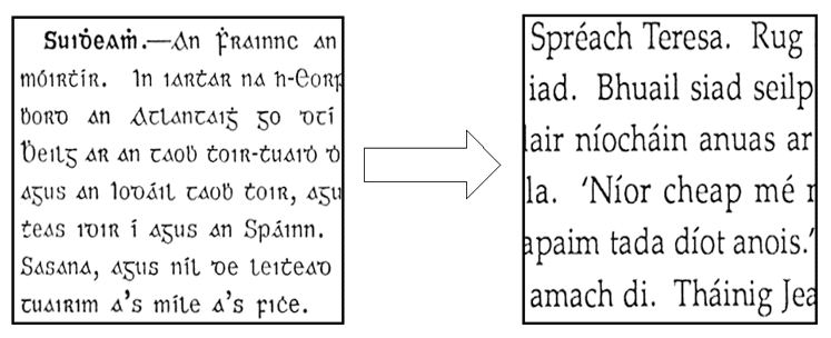
After this typographic reform there was a transitional period of 24 years during which no new typefaces were designed. Since 1988, however, approximately 50 Gaelic typefaces have been produced and Gaelic typography is currently in the middle of a renaissance. Gaelic typography has moved from the realm of propaganda into the neighbouring field of advertising and triggered a renewed interest. No longer important in the political communication of Irishness it has become a means to sell all things Irish on the international market.
It is significant that none of these new typefaces are being used for the printing of books. Gaelic fonts are generally used exclusively for headings and logotypes. The government’s delegitimisation of the Gaelic script has proven to be permanent in the book trade. Graphic designers often use vernacular writing styles to suggest tradition, craftwork, authenticity or to pinpoint a particular geographical area to their target audience. When it comes to suggesting Irishness, the most popular typeface on the market is American Uncial, designed and cut in 1945 by the Austrian type founder Victor Hammer.
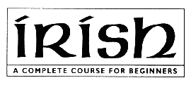
While aesthetically quite attractive, this is not a very readable font. Nowadays, it is generally used for titling and display work and even then it is not always easily decipherable. On top of that, it is not suitable for setting Gaelic texts, lacking some of the necessary characters. Nonetheless it is now very definitely perceived as Irish, especially in the United States.
To summarise: Irish typefaces have generally been designed to impress on the reader a sense of Irish identity, whether in terms of religion, national politics or cultural tourism.
Retrieved from: https://journals.openedition.org/lisa/2546
—
Analyse how effective the examples of type design communicate place and the identity of that area. Consider its material make up, role, use and application, with regard to its location (eg the changing fortunes of the high street, or gentrification.)
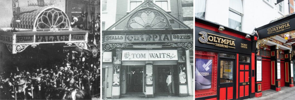
OLYMPIA THEATRE FASCIA
72 Dame St, Temple Bar, Dublin 2, D02 K135, Ireland.
The typography dates from 1879, and originally read The Palace ‘Empire’ Theatre; a reflection of British rule. It was renamed in 1923 post partition of Ireland and the ‘physical’ name was updated after the roof collapsed in 1974, the typographic styling was retained.
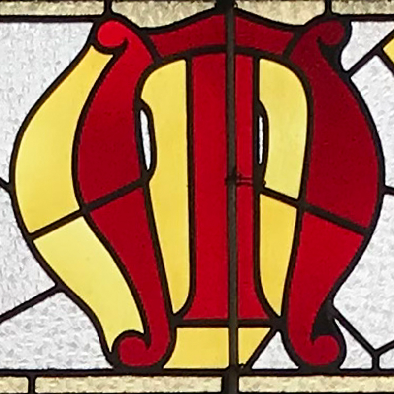
A typical example of Victorian display, with its decorative forms; it retains a certain Celtic charm, has medieval reference points and added ‘stenciling’ created by the stained glass. In keeping with the Georgian buildings of Dame Street it is a true survivor. However with another name change, the sides of the facia now have unsympathetic typographic additions.
(Research: https://www.3olympia.ie/about-us/venue-history).
—
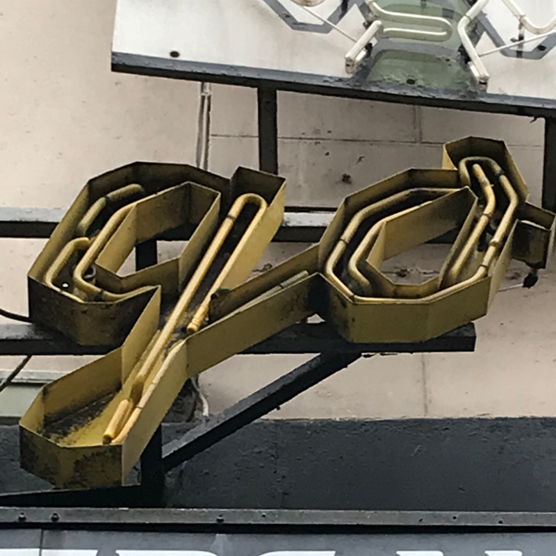
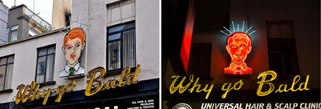
WHY GO BALD SIGNAGE
3 South Great George's Street, Dame Ln, Dublin, D02 NW68, Ireland.
‘Mr. Why Go Bald’, was originally erected for the Universal hair and Scalp Clinic by Taylor Sign’s in 1962. After a period of disrepair, “Bono’s favourite Dublin landmark” was refurbished in 1999.
At first glance you would think that the design is much older with its late Art Deco, early 1940’s styling. I think the fabrication has a lot to do with this as the script is ‘boxy’ and sharp. The neon gives it a unique inline and the colours it’s personality. This styling is on trend now with designers trying to capture ‘authenticity’, looking to the past for inspiration.
(Research: https://www.atlasobscura.com/places/why-go-bald-sign#:~:text=Known%20locally%20as%20Mr.,based%20family%2Dsignmakers%20Taylor%20Signs).
—
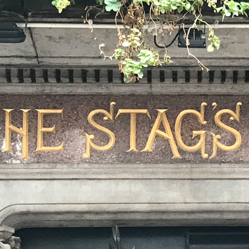
THE STAGS HEAD PUBLIC HOUSE
1 Dame Ct, Dublin, D02 TW84, Ireland.
Designed as an example of high Victorian style in 1894, ‘The Stag’s Head’ seems to have remained untouched and unaffected by period changes or globalization. This is also true of its elaborate interior design.
The typography on the fascia shares some synergy with the Victorian display styles found on the Olympia Theatre, but once again there seems to be some details that mark the type out as being bespoke and Irish such as the cross bar on the ‘A’. The chiseled forms refer to the craft of the stone mason and the ornamented serifs are Celtic scroll-like in influence.
(Research: https://stagshead.ie/about/#:~:text=The%20Stag's%20Head%20
was%20the,shirtmaker%20to%20the%20Lord%20Lieutenant'.).
—
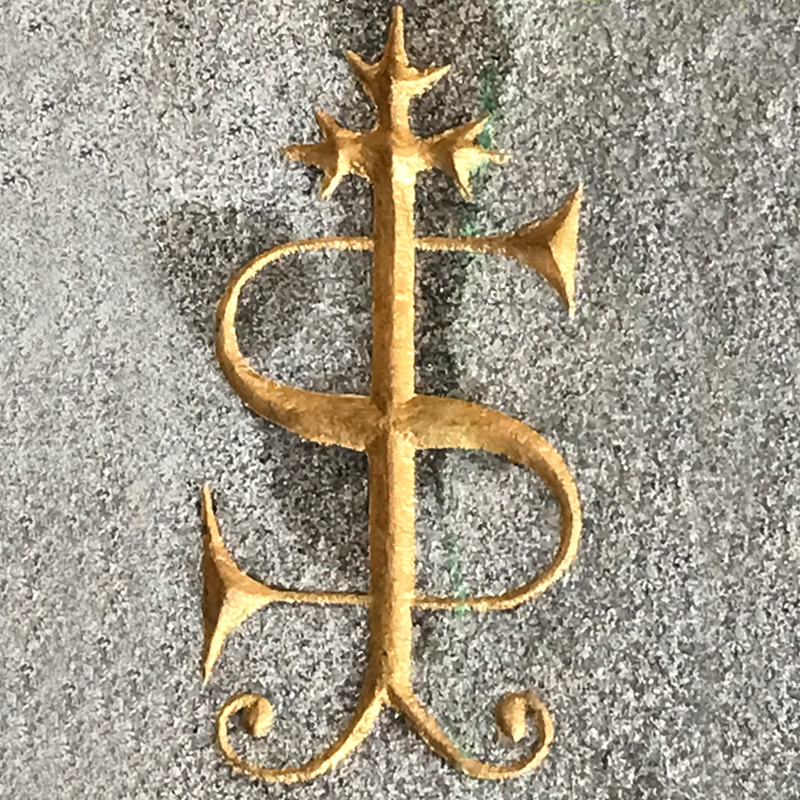
THE CARMELITE CHURCH
56 Aungier Street, Dublin, D02 YF57, Ireland.
The Aungier Street entrance was added to the 19th Century Carmelite Church in 1951, the main entrance being on Whitefriar’s Street. Not strictly Irish in design, it represents Catholic and period style, in keeping with that of the church built in 1844. The monogram is carved into granite giving it texture, and the gilt, lustre. The letters represent St.Theriese’s shrine of Liseux on which the architecture was based, with the ‘T’ becoming a crucifix. The country’s recent loss of trust in the Catholic church was a massive shift in Irish society and for some this iconography may hold negative connotations.
(Research: https://www.whitefriarstreetchurch.ie/index.php/the-church/history).
—
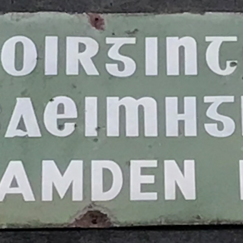
TYPICAL DUAL LANGUAGE IRISH STREET SIGNAGE
Camden Buildings, 22 Camden Pl, Íochtarach, Dublin, D02 AX97, Ireland.
Dublin Council first rolled out bilingual street signs in 1922 as part of the Gaelic revival movement. Originally black and yellow, an increasingly nationalist council, went for green and white in defiance of the British authorities in classic show of “non-violent, civil disobedience”. Originally written in Cló Gaelach (the old Irish script) with Irish first, the signs were later changed to latin as part of a wider modernisation of printed Irish. In the 1960’s example shown here you can see this uncomfortable marriage between the latin alphabet and Irish capitals. Since 1965, Irish is set using latin characters to this day.
(Partly retrieved from: https://www.dublininquirer.com/2020/06/10/
documenting-the-history-of-some-of-dublin-s-mismatched-street-signs).

