
REFLECTIONS ON THE LECTURES/SOURCE MATERIAL
MICHAEL WOLF
Direct correlation between the task set in our first module. Curiousity: the what, where and how something is the way it is. Appreciation: The stepping back and noticing the world without questioning; after which comes the Imagination. Branding an answer to fundamental questions of what a design does and what value it brings that makes a brand attractive, treasured and chosen. How you create an emotional connection.
"Only through the sum of the parts that the whole is delivered".
Michael Wolf
—
— Can be applied to my own journey of discovery into the who, what, why and where.
— Good to take a step back from the act of making and instead follow a path of understanding.
—
PAULA SCHER
Core set of tools are New York (the where), her intuition (the why), and a sketchbook. Seymour Chwast/Push Pin: Intelligent social commentary meets illustration, typography and play. Lightbulb moment: Push Pin the bridge between typography being a cold, mechanical, functional exercise with no inherent value or meaning as something that had its own set of sensibilities, spirit and meaning.
— Tries to paint an environment in Pentagram where everyone has a voice while she is essentially 'the designer'. Gives the impression that the team are just another set of tools at her disposal; building on her design observations and sketches.
"Design exists beyond screens"
Paula Scher
—
Quantitive reasoning: Natural ability to synthesise a lot of information in order to find a solution. Getting the messaging right is everything to her, and poor communication can have serious consequences.
"Design has to take human behaviour into account".
Paula Scher
— Contradiction: In her daily communication work the message is so clear and yet her personal work only seems to makes sense to her.
Strategy: Why an identity looks the way it does, the part that it plays in the scope of the business. Questions gain a greater understanding of the actual problem. Intuition: Making, questioning, searching and practice. Hardest part of the design process is not the design in itself, but the persuading of people to see and understand your vision.
"You have to be in a state of play to design. If you're not in a state of play you can't make anything".
Paula Scher
—
ADRIAN SHAUGHNESSY
Entry into design unfulfilling, undervaluation of him as a designer which led him to start INTRO design. Mantra: Creativity vs profitabilty.
— In my experience money motivated designers are in the business for entirely the wrong reasons, creating poor work.
— I believe If you do great work, money will follow. Personally not money motivated. Creative fulfilment comes first.
— Your location and the cost of living and studio space all have a part to play
— A shared space seems to be a great way to start and also not to isolate yourself from other creatives.
'Solitary designers specialise and studios collaborate'.
Ben Bos
—
— Collaborating = cost consideration: How you pay the third party fairly for their efforts. For a small practice this is not always possible.
REGULAR PRACTICE/LEHNI-TRUB/SOMEONE/INTRO/SARAH BORIS/SAM WINSTON/EDEN SPIEKERMANN
Location of contemporaries to practice = Natural exchange of ideas that can be brought to bear on their individual practices. Bespoke self realised publications (Lehni-Trub) or larger identity work (Someone).
— Collaborative process important.
— Have a clear vision of where your practice sits, the type of clients you want and area of discipline.
— Staff should be able to feel they can take ownership of the work created.
INTRO partners Jullian House, Adrian Talbot and Julian Gibbs all work independently of each other. Collaborate when they can't solve a problem themselves. Differing approach and skillset to bring to the table. Sarah Boris and Sam Winston: Individualist, artistic approach. Client commissions based on previous work produced.
— Difficult for a larger studio to have a common voice today because of the constantly evolving nature of the business.
Someone prove this to be true: Breath of the client work they undertake, purposefully 'difficult' problems that they seek.
— Superstar designers: Team of minions where the individual only exists through the name above the door.
Erik Spiekermann points out 'More than 7 people = more complication" which is true. Erik Spiekermann learned this in META as the practice grew to 120+ people, made him a "tiny bit crazy".
— Spiekermann's 'ideal' working space: Laboratory experiment rather than a place you would want to work in.
— No individual ownership enabling designers to thrive and be fulfilled within a large working structure.
— Smaller agencies (Regular Practice): Manage the balance between the work they want to create, creative fulfilment, the right location and cost of living.
— It is important for a designer to grow and gain from the experience of working for a larger agency and to know when to move on.
—
TAKE OUTS FOR MY OWN PRACTICE
– Create a space where collaboration, solitude and client meetings are all possible
– Decorate it within your means in an inviting and practical way. Plan the space
– Weigh up location costs vs cost of living but also the creative buzz that happens around you externally
– Collaborate with your peers, whether over a pint or creating a project together
– Collaborate with people who are better than you
– Avoid formulaic work where possible
– Self promote and self publish
– Look for clients you want to work with, not necessarily clients who want to work with you
– Work for the common good
– Stay curious and question everything
– Be disciplined about your own work/life balance
—
WORKSHOP CHALLENGE: WHO, WHAT, WHERE, WHY
Who are you? (Name, background, influences, what makes you you?).
— Wes Trumble.
— 1968: Born in Woolwich, London.
— Creative family: Grandad made toys. Mum and Stepdad write poetry. My Stepdad (John) is also an architectural draftsman (still active).
— 1972: Pivotal moment: 4 years old drawing with finger paints. Knew that that there was an indescribable connection.
— 1973 - 1984: School: Not academic. Loved art, acting, music, english and history. Left with 1 O'Level (Art) and 1 GCSE (Visual Communication).
— 1984: Art college in Eastbourne/BTEC Diploma (foundation) in GD & Art. Chose design in second year to explore more creative avenues. Passed with merit.
— 1986: Barnet College, London/HND in GD & Vis Comms. Learnt design craft. No computers and everything 'made'. Passed with high merit..
— 1987: Worked at Bite It! (Trevor Jackson/ex Barnet student) and KUNST (Shem Law/Martin Huxford).
— 1988: College show at the ICA.
— 1988: Offered position on Observer Magazine by Shem Law but turned it down.
— 1988: Started working in summer after brief work experience with Coley Porter Bell.
— 1988 - 2017: Worked in London, Belgium and Ireland and gained valuable design and communication experience.
— 2017-2021: Set up small business based in Dublin specifically set up to cater for agencies (freelance) and small businesses.
Who am I today: I am Wes Trumble a 53 year old designer, passionate about design, art and music looking to explore, discover, learn, research, play and design. Hope to find my own unique voice in design and to bring these learnings and experiments into my daily practice.
Background: A wealth of experience but always willing to learn new things.
Influences: Type, Typographers, Art and Artists, and Music. Malcolm Garrett, Barney Bubbles and Peter Saville. Constructivism, Rodchenko and the Bauhaus. Love all forms of design and art from the Impressionists onwards. My music spans all genres from Blues - Electronic Music. Mad on films. Love Guy Van Saints photography in Elephant. Secret of the Beehive is my favourite film to date.
What makes me who I am: I am a risk taker with a desire to create more expressive work.
The end goal is to reinvigorate myself and my practice with a well rounded balanced business offering more scope and dimension, more research and thinking and more experimental and experiential design within the cultural arts and music sectors.
—
What is it that you do? (Showcase a pivotal project or moment in your practice).
CASE STUDY/PIVOTAL PROJECT (LIVE WORK: PLEASE DO NOT SHARE, THANKS)
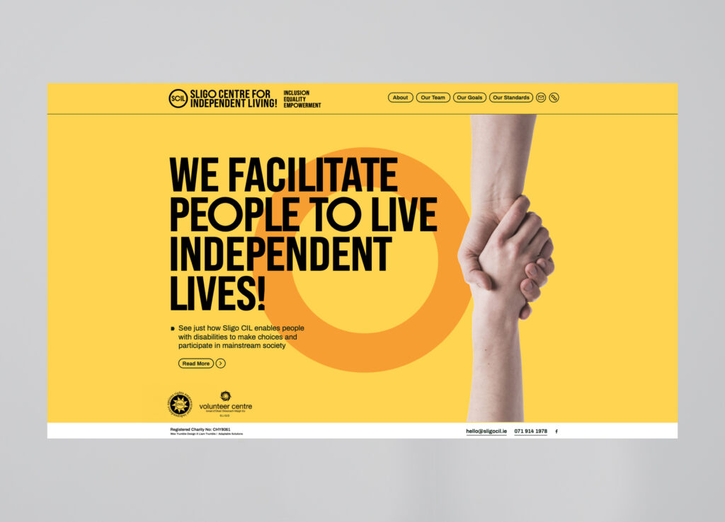
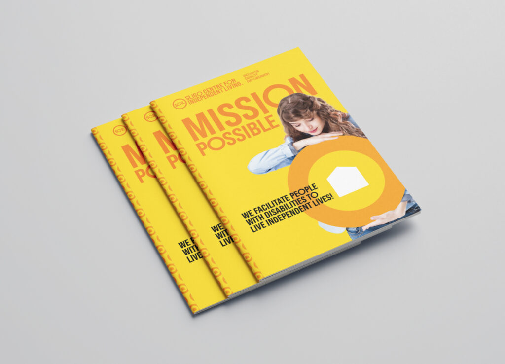
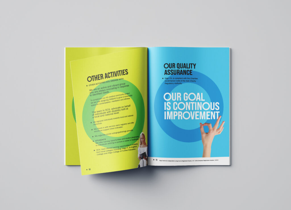
Who and Why: Sligo Centre for Independent Living (SCIL), a charity who's core business focuses on the needs and welfare of severely disabled people in the community, enabling them to live as normal lives as possible, and to create a social interactions and connections with people of similar abilities within Sligo town. This instills in them a sense of independence both in the home and socially, and can also lead on to employment and study opportunities for those who engage in the programme.
What: Typically, they were looking to just update the logo. We set about asking the who, what and why to greater understand the business, and from this were able to bring our client on a journey that would re-envision the charity as it sees itself: progressive, young, vibrant and fun – a safe place to be.
We explored different avenues of design looking specifically to create something so iconic that the community could engage with SCIL directly. Their previous identity was a blue and yellow sun device - which nearly all of the CIL's in Ireland have. We took this sun device as the starting point with our solution leaning strongly towards a simple circle' The circle represents the sun in an iconic and abstract way. This simplicity allowed us to build up a kit of parts, and in adapting an existing typeface, bring elements of play that gave the design a unique tone of voice. This combined with a poppy colour palette belies the serious nature of their work, but enhances the values the welcoming team bring to the charity. To highlight their personalities, we also created a set of 'independent living' icons, asking the team to come up with their own ideas for each one based on their roles, and how they are perceived within the organisation. This added a personal touch and made everyone in the organisation feel that they were considered in the process. The team have all responded well and this is currently being rolled out across a website, brochure and internal templates.
Where: Sligo, in the North West of Ireland.
—
Where are you? (geographically and does this have an impact on how you work?).
I currently live in and work in Dublin which is a melting pot for creativity and we have all kinds of studios, artists and designers here, some more craft based and others more traditional. Dublin itself is a small city so everyone knows each other. I think this creates a distinct community, especially in design as we all support each other to do well in business. We are not in direct competition.
Here in the South East people really see themselves as progressive and modern. This was proven recently in passed referendums for Gay Marriage Equality and Abortion Law.
The government does well in encouraging businesses here with its low corporate tax rates. They are also tech savvy, entrepreneurs and are leaders in emerging technologies, and It is no accident that Deloitte, Google and Facebook all have headquarters here.
In conclusion the place I live, the people I know, the colour, light and life of the city all come into my work whether subconsciously, through language, the visual landscape, the natural environment or historically. The Irish have an acute understanding of their history and their place in the world and it is through these connections that the country thrives and pushes itself out into the wider world to achieve greater things.
The only downside is that it is one of the most expensive places to live in Europe.
—
Why Design? (What does design mean to you? What does it do?).
Simply put I can't or wouldn't want to do anything else. Design = Life.
It is a constant learning process: The journey you have to take yourself on as a researcher, strategist, marketeer, creative, persuader, art director, print specialist, digital artist and coder – and if you have your own business, project manager and accountant is invaluable. I don't know any other business outside of the creative realm that has to wear so many hats.
Every new generation comes along with its own voice. The work currently out there is a constant source of inspiration. When people say it's all been done why are we constantly surprised by our creative peers? It's an indefinable art, a commercial practice, a strategic one and in its essence emotive.
Design can change the cultural landscape or the way we see things forever. It can make or break governments, help drive social change, help you make life choices and put a smile on your face. It's an emotional connection through communication, colour type and style achieved by creatives on a daily basis.
We can't wake up without seeing and connecting with design. Design is everywhere and it is our duty as designers to make it easy to navigate and engaging for whosoever comes in contact with it, and that is not to say we can't have fun and play along the way.
—
WORKSHOP CHALLENGE: QUADTRIPTYCH
IN BRIEF
In approaching the quadtriptych I felt I first had to immerse myself in my own self reflection. This has help me distill my initial thoughts and simplify. I always set out with the idea that I would create something bold and graphic and unified – so each piece will work on its own but means something else when its brought together as a whole.
One thing that stood out for me was the format where the 4 pieces come together as a grid. I was thinking about how heraldry works and splits a shield or shape into four which then led me onto Peter Blake and his dazzle ship. I thought this idea was quite strong because it's almost like I am opening up for the process while protecting myself from oncoming missiles.
INITIAL SKETCHES
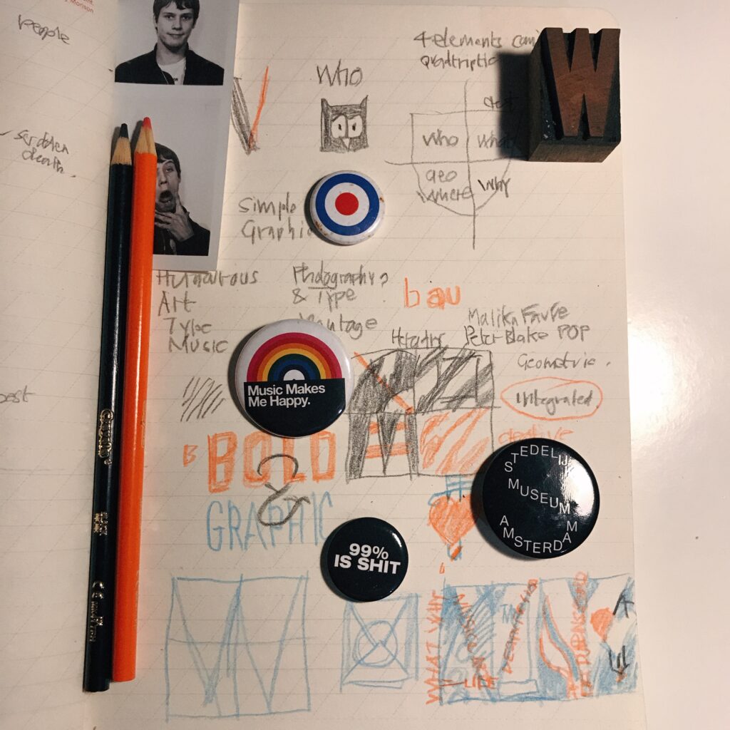
ABOVE: Initial sketches with key words: Humorous, Art, Type, Music, Simple Graphic, Bold, Photography/Montage, Malika Fauvré, Peter Blake, Geometric, Integrated, Heraldry and Creative.
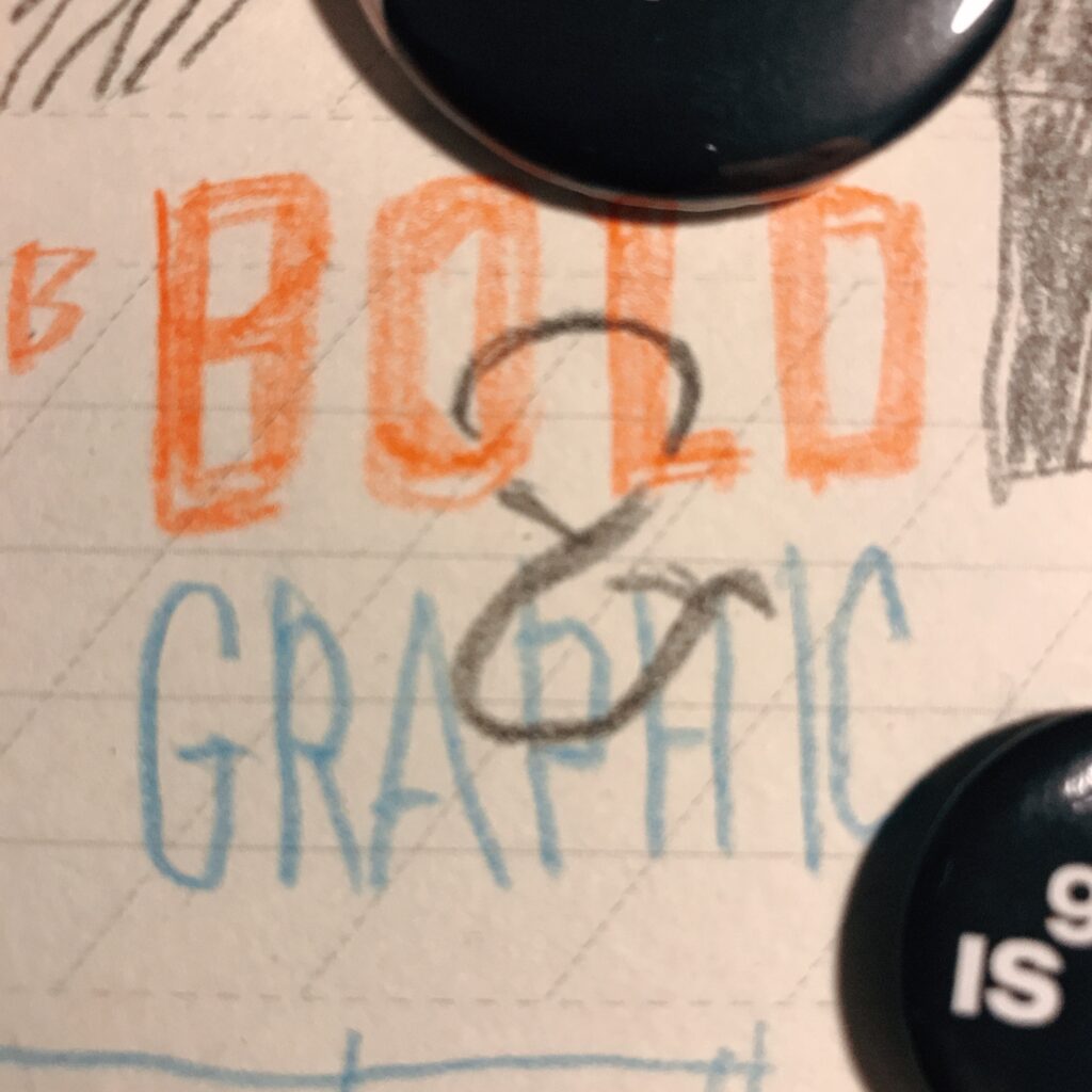
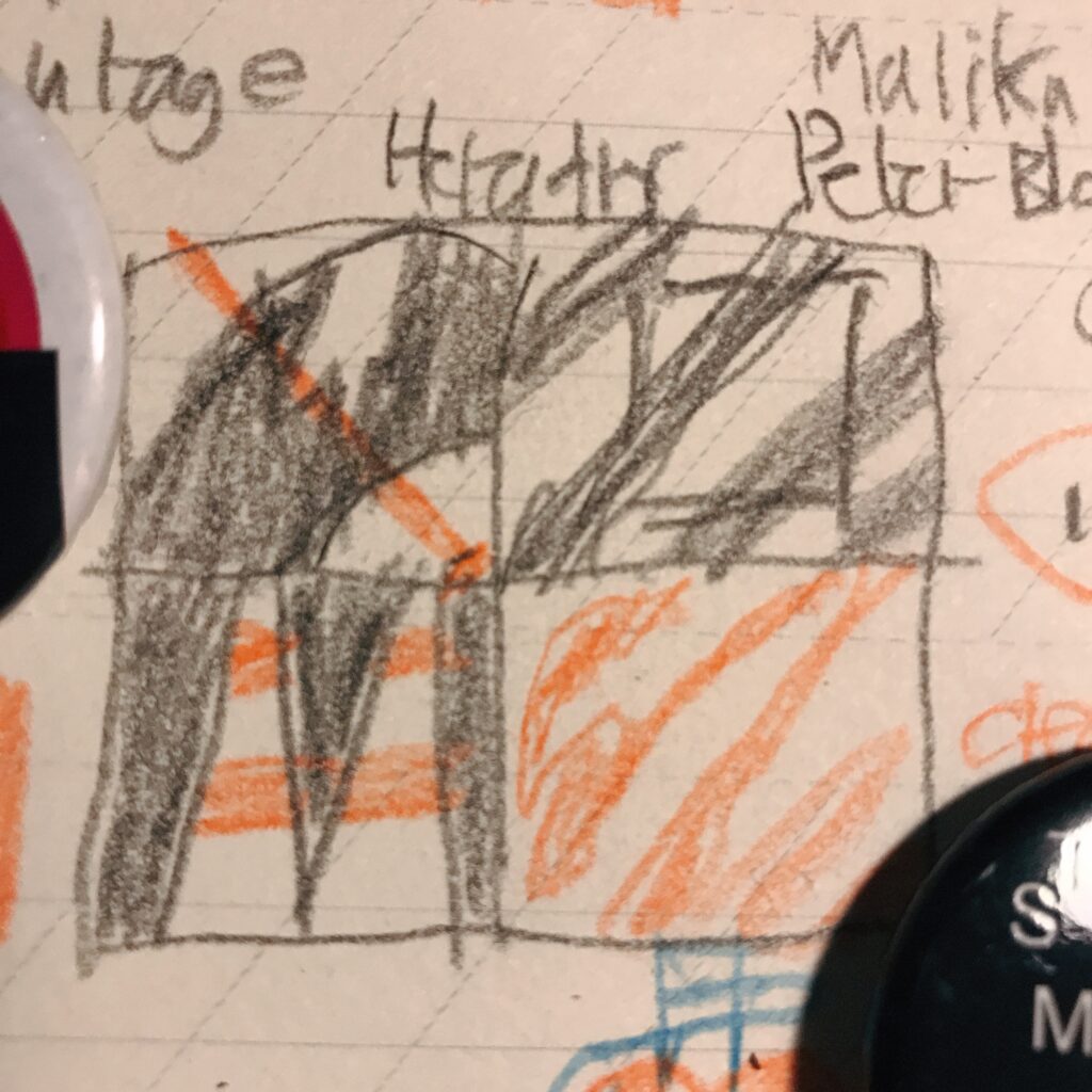
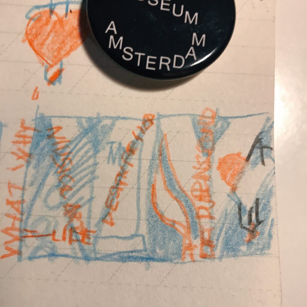
ABOVE LEFT: My mantra for the piece. ABOVE CENTRE: A heraldic split. ABOVE RIGHT: A tall panel split using the 'W' of What, Why etc to integrate the piece.
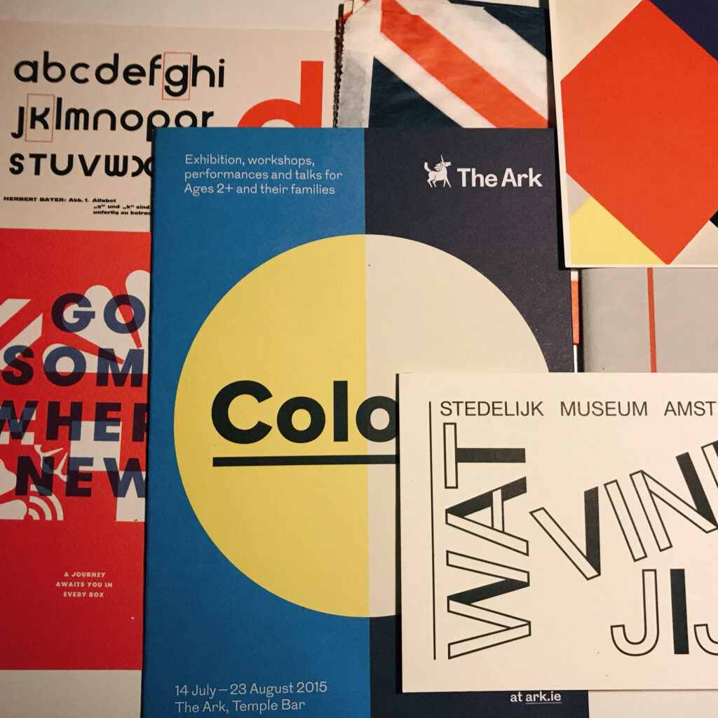
ABOVE: Some design inspiration.
THOUGHT PROCESS
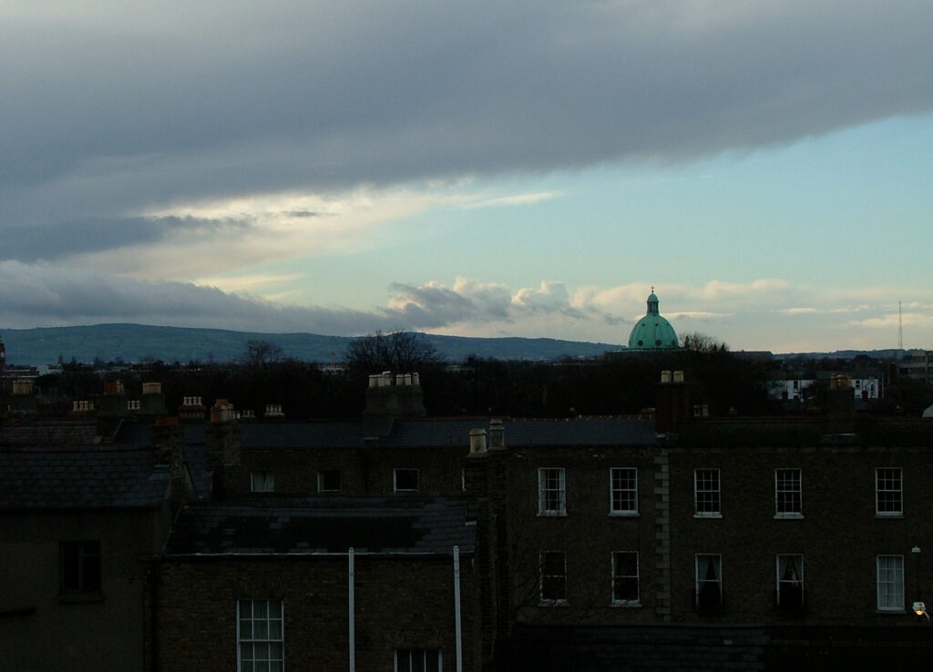
The core of my thinking comes from stripping out the essence of each category from the discovery. The first panel (who) is Music & Art. If they didn't exist I wouldn't get out of bed. The second panel (What) showcases a pivotal piece of work but in a paired down linear way. The third (Where) belongs to the Iconic chimneys of Poolbeg power station in Dublin. It is slightly overused by the tourism industry and designer's alike but it give the sense of place better than any other graphic. The final and fourth panel (Why) is emotion, passion and creativity. I was playing with a love /hate idea here but I am moving towards the positive in my latest sketches.
THE IDEAS WALL
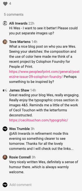
Unfortunately not much was said about the piece on the wall apart from Alli Inwards commenting that it was hard to see which was fair enough... I'm surprised I even understand my own thumbnails sometimes. Therefore I have developed the following sketch and will guide people to this post for further reading and hopefully it starts to make sense.
I am going to explore to recommendations on (Tove) Colophon and (James) Cecil Touchon tomorrow to see if this helps me improve on the concepts.
SKETCH DEVELOPMENT
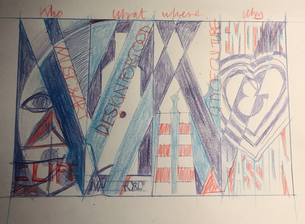
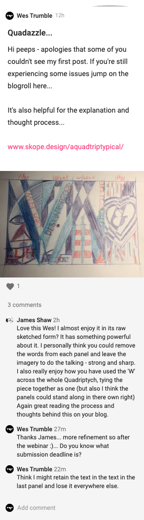
ABOVE: Refined sketch - as you can see I've removed the paint pallet idea in the first panel and gone for a Picasso style face and the last panel still has the heart but just using emotion and passion as typographic supports. I am ready to post now so lets see what the feedback is…
THE IDEAS WALL
James fed back with an interesting note about the amount of type I was proposing for this so I will explore this as I start to work up the design.
FINAL EXECUTION
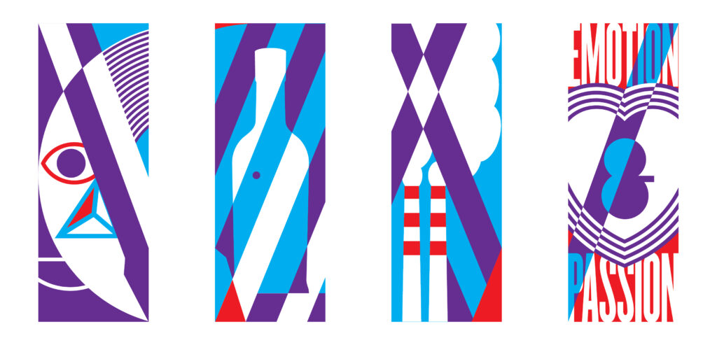
ABOVE: Seperated panels. Took James' advice and removed some of the typography. Think I like the simplicity of the two central panels best so will look at how I simplify the others. Bolder more graphic?
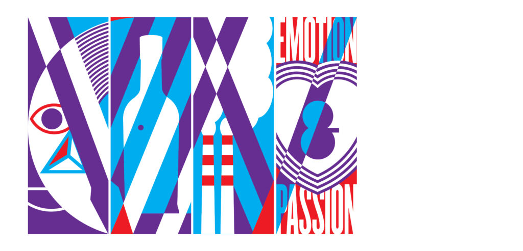
ABOVE: Unified panels. Also wondering whether more dimension is required. Watch this space...
...